N2 11th Anniversary
—–
To celebrate Nsquared’s 11th anniversary, co-founders Nathan Tyler and Natalie MacLees look back on how BlinkMetrics began — from a messy spreadsheet solution to a smart, all-in-one data partner for growing businesses.
What started as a simple way to make sense of scattered numbers has become a platform that turns data chaos into clarity.
BlinkMetrics now helps teams using tools like Asana, HubSpot, WooCommerce, HelpScout, and Keap see what’s working and make confident, data-driven decisions.
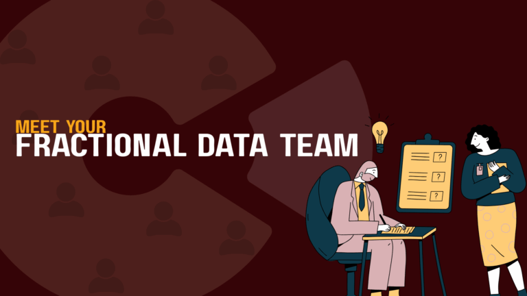
In honor of 11 years, Nsquared is giving away 11 one-month “Fractional Data Team” experiences — a 100%-done-for-you dashboard setup designed to help your business finally get the insights you’ve been missing.
—–
Nathan Tyler: All right. Hello everybody. We’re live. I am Nathan and this is Natalie.
Natalie MacLees: Hello everyone.
Nathan Tyler: This is our 11th year of doing this thing.
Natalie MacLees: 11 years of putting up with you.
Nathan Tyler: It’s been nothing but a dream the entire time, right?
Last year we did the “Ask me Anything”. We got a bunch of questions from our team and that was a lot of fun. This year we thought we would, give a little bit of an update on BlinkMetrics and some of the changes that we’ve been going through over the last few years and our journey getting here.
It probably all started when Natalie was a little tired of me. Going all over the place randomly every week and said that we needed to implement EOS. So if you want to talk a little bit about that and how we got into that.
Natalie MacLees: Yeah, so I guess we should say EOS means Entrepreneurial Operating System. Gino Wickman is the author of a book called Traction that will walk you through getting EOS set up in your business, or you can hire someone to help you, but it’s a way of managing a business and staying on top of all the different aspects of the business that you need to.
It breaks the business up into six parts. Helps you to set goals and track your progress toward those goals and keep the whole team all up to date on what the company’s trying to accomplish so that everybody is participating and knows that what they’re working on is contributing to the success of the company.
Part of getting EOS implemented in the company was setting up scorecard. So you have to identify some key metrics that help you figure out, are we being successful? Are our efforts succeeding? Do we maybe need to adjust our approach? We got started by building out a Google sheet.
Nathan Tyler: I think that’s how most people end up starting, is just copy pasting metrics from different places.
At the time, we had Draw Attention and Simply Schedule Appointments our two WordPress plugins. We’re both still running agency client services at the time. We ended up with multiple scorecards and we’re copy pasting from many places because the whole point is to get that kind of snapshot of different parts of the business. You need some marketing numbers, some numbers from the website, some numbers from Google Analytics, some numbers from your CRM customer support.
Natalie MacLees: Yeah.
Nathan Tyler: Invoicing, QuickBooks, Stripe, all of the places and so I think the first version of it was a bunch of bookmarks that we would open up and copy paste.
Even that is a lot of work to be doing every week. It also had the problem of you couldn’t easily look at the numbers monthly or quarterly or look for broader trends. It was just a lot of manual data entry. We started, our first version of BlinkMetrics actually was in Google Sheets.
We were just copy pasting numbers automatically with code and with APIs into Google Sheets. and then we kind of went to market with the prospect that automating the scorecard would be like the primary product that BlinkMetrics. The primary problem is solved and I think. What we found along the way was that there’s kind of two parts of this data.
There’s the scorecards, which are great for monitoring. Like, you know what you wanna measure, you know, your KPIs and you just wanna see them every week, every month. You wanna get alerted when it goes too high or too low but it’s not as great for analysis, right? And some people don’t know what they wanna measure yet.
They don’t actually, there’s data in their business that’s really hard to see. Questions that are hard to answer that they need to understand better in the first place before they put it on the scorecard. So I think, our first version really was focused on the scorecard, and we still have that, that’s a really core part of the platform.
But I think over this last year, we’ve really focused more on the dashboards, which is good for analysis – let me see all of my customers and data is sprawled similarly across tools because you might have people submitting lead forms. They might be in your CRM, they’re in your billing system, they’re in your support tool.
There isn’t like a view that – it’s really hard to answer some of those questions where the data goes between systems, so we’ve built these dashboards that really help answer those hard questions and help you do that analysis and let you. Filter by customer, filter by product line, filter by employee, and see all that data in your business. You can understand it.
There’s a lot of useful insights and missed opportunities just because it’s so hard to look at your data holistically, we’re really starting people there. And then once you’ve done that and you do that a couple times. Then it becomes pretty obvious what number you actually wanna track on the scorecard. So I think that’s been a lot of our changes over the last year.
Natalie MacLees: Yeah, big changes. I remember when it was just automatically filling in cells in a Google sheet.
Nathan Tyler: Yeah. It was so exciting at that point. I know. It’s so silly.
Yeah, and we found that like the spreadsheet is kind of a, a double-edged sword. It’s loved and hated, like for most small businesses, like spreadsheets are the only way to get answers in your business. Everybody’s very used to it. I export this CSV and I export this CSV and I have a Zapier Zap that pushes data into this tab.
And I have VLOOKUPs and you know, people can make really elaborate spreadsheets ’cause it’s kind of the only way to do this short of having a $600,000 BI team at your company, which is a whole different kind of company. But the spreadsheets are a lot of work and it every time you want to answer one of those new questions, like, oh, I wanna segment by employee, or I wanna segment by customers who purchased our business plan.
Each of those is a bunch of manual spreadsheet work, and that’s like a one-time effort. And then there’s the maintenance aspect. If you wanted to be able to do that on a monthly basis, now you’re looking at just an immense amount of spreadsheet work.
Natalie MacLees: Yeah, a lot of manual data entry and being very careful ’cause if you type something in wrong, you’re gonna get the wrong answers.
Nathan Tyler: Yeah. And that is one of the other issues with the spreadsheet is it’s really hard to audit, to trust the numbers. ’cause if the numbers aren’t trustworthy, defeats the entire purpose and in fact gonna steer you in the wrong direction.
What’s critical is that you do trust the numbers and in a spreadsheet things get kind of tucked away in other tabs. Or maybe it’s exported from some system, but you can’t actually see the underlying data. Versus with a dashboard, like you can see those same answers and calculations but then you can drill in and see the table and you can see those five customers names and verify those are the five customers who purchased yesterday and you can have much more confidence in the numbers.
I think what we really ended up centering around is, having people show us their crazy spreadsheets and help them find a way to, convert those into a live operational dashboard that they can use to make everyday decisions in their business. That those spreadsheets are the perfect blueprint for us to use as we’re building these dashboards out.
Because you’ve already done the math, the formulas are very straightforward. The fact that you even have the data in all these lookup sheets means that the data is available somewhere, and it gives us the perfect map for how to. Turn that into a live dashboard that’s automatically feeding the data all the time.
It’s always up to date and will give you way more flexibility to slice and dice by any filters that you want, to answer questions in your business.
Natalie MacLees: So when you see the customers that are using just really tricked out spreadsheets, how much time are they spending building those and then keeping them up to date?
Nathan Tyler: Yeah, so there’s a few different kinds. I would say there’s definitely the one-off effort, like somebody’s like, oh, we did this at the beginning of the year to like look at how last year closed out. And that’s really like a one-time thing. Somebody does, or maybe they do it a second time.
It’s kind of an ad hoc analysis that, it was painful enough that somebody was tasked and maybe spent 10 or 20 hours or a week or three, like building this spreadsheet and trying to get this answer but it’s not something that they do on a recurring basis. And then there’s other ones that they’ve identified we really do need, like, I really wish this report was in our CRM, but it’s not.
And so I have to export these three things and then. I do this every week or even every day or every month. And those recurring ones are the ones where people are really feeling, the frustration because it’s taking time. There’s usually some key person in the business who doesn’t usually have that job title, who’s stuck doing it.
And if that person ever left or is on vacation, that report, there’s no way to generate it and it’s not really the best use of their time anyway. Even then, it’s still lagged. Like if they’re doing it once a month, they can’t pull it up any day and they can’t filter it and segment it by anything that they want.
Natalie MacLees: Yeah, so not enough flexibility built into it. But if you just have a big pile of all the raw data that’s getting updated automatically. Right.
Nathan Tyler: Alright, so we can maybe show, we have some like demo and sample content that kind of illustrates this a little bit better too. I can share my screen and go through it.
Natalie MacLees: Okay.
Nathan Tyler: Couple things that we have here.
Natalie MacLees: Did that show up?
Nathan Tyler: All right?
Natalie MacLees: Yeah, I see it.
Nathan Tyler: This is our homepage. Of course, everybody can browse, but it has some nice snapshots that show like the capability of what we’re able to do.
We’re able to take all that raw data from your individual tools and we can replace those spreadsheets. And we have a very streamlined process and offering. We meet with people once a week and we take their messy spreadsheets and we turn them into automated dashboards that answer all of those questions, everything we were just talking about.
We still have this scorecard view, there’s a number of different use cases and things that this can be fit to. Everything we’re just talking about the problems with spreadsheets, like all of this manual effort, all of this house of cards that people construct with Zapier zaps and exports and imports and VLOOKUPs.
It’s really empowering at the beginning and then it just does not scale in any way.
Natalie MacLees: Imagine it gets harder and harder to stay on top of. As your sheets get more sophisticated, they get more helpful, but then harder to maintain.
Nathan Tyler: Yes, exactly. And the data is not really in the granular format that it needs to be to do any kind of reporting that you want. Because if you wanna report it quarterly instead of weekly, sometimes that’s hard. Or if you wanna segment by. Something. If that data’s not in the export that you’ve got, then you’re kind of hit a ceiling where there’s nowhere else to go, and the way that we solve that is we bring all the data in very granularly so that it can be analyzed any way that you want.
We connect to all sorts of business tools. You know, we’ve got a hundred plus SaaS apps that everybody’s using to run their business. We can pull that data in. We can get any kind of visualization or pivot table or table of data that you want to see. Any level of granularity or visualization, we can do some pretty fancy stuff with it.
And the other aspect that’s missing in, spreadsheets is sometimes there’s numbers that are mostly fine most of the time, and it’s a redundant thing to be looking at it every week. You really just want to know the moment that it slips off track. And so we have, automated alerts so you can set explicit targets and goals and you can be notified if those KPIs are slipping or they’re beating their target.
We also have permissioning. This is another issue with spreadsheets, is that you can protect who edits a sheet in Google Sheets or Excel, you can say nobody can edit this, but you don’t really have the level of granular permissions that you want. And in a company, everybody needs to see different things.
You know, the executive or leadership team is gonna need something totally different than the person on the front line doing the day-to-day work. And the managers, you know, the management layer in between need to see different data as well. So everything that’s being presented, in the dashboards or the scorecards can be controlled and permissioned, who needs to see it and when.
Natalie MacLees: Yeah. You can’t, in a Google Sheets, you can’t go in there and say, oh, this person should only be able to edit these five rows.
Nathan Tyler: Right.
Natalie MacLees: They can either edit or they can’t.
Nathan Tyler: Yeah. All right. So this is the part that I’m most excited about, is that we can really do this in such a streamlined fashion. Now we have a 30-day process where we can just meet on Zoom once a week.
You never have any homework coming outta the calls. We show you each iteration as it’s going and then in 30 days you have something that you can actually use and replace your spreadsheets. So we’ve done this ’cause we have all these integrations pre-built out, we have a lot of templates and things to get started.
If people don’t know where to start, we can fill all of those gaps, and we’ve built this platform specifically around small businesses and being able to do this very quickly and cost effectively. This is all the work that, you know, I used to do building data pipelines and for larger companies, this might be a six-month, 18-month, 24-month engagement, like where you’re building up all this infrastructure and making all of these architectural decisions and we have a really streamlined way to do that now.
Natalie MacLees: That’s really nice. So within a month I have my spreadsheets replaced with something new that updates itself automatically.
Nathan Tyler: Exactly. Okay, so I’ll show a couple. Like this is one of the scorecards. So this would be like a software company. And this is, if you’ve established your KPIs, you can actually see them all in one place.
You can see, kind of if you go from the top of the marketing funnel all the way down through service and delivery just gives you a real snapshot of like. Social, traffic, traffic on your website, people submitting a lead form on your website. Number of meetings that were booked, number of deals in your CRM, all the way down to the dollars in your e-commerce platform or your QuickBooks online.
Numbers from all across the business, and you can get graphs and trend lines, for like projections of where the month is gonna end. You can set explicit goals and you get this nice color heat map so your eyes can just immediately snap to the numbers that colors change from month to month.
Natalie MacLees: But what if I’m red, green, colorblind?
Nathan Tyler: We have, I think five or six different color schemes and ways of displaying. You could do a thumbs up, thumbs down. You can do different color schemes that are built in there as well.
Natalie MacLees: Or icons. You could switch to using icons instead of colors.
Nathan Tyler: And any of these numbers has a link to go straight to the source where it came from so it can go right to Google Analytics or right to your customer support tool to that date range, and it can instantly verify that number and do a little bit of investigation. We also support calculated metrics.
So the formulas that you would have in Excel to blend data from different sources, we have that as well, and then I think the dashboards is the area that we’ve spent the most time over the last year. This is an anonymized demo dashboard here, but looking at it like a WooCommerce store. Where it’s hard to see this level of data that this quickly inside of, like WooCommerce reports, it’s pretty good at showing you generally order volumes and how much is happening in your store in terms of money. But if you want to do anything around inventory, for example, it can be really, difficult to find that in WooCommerce.
Most people end up exporting to a CSV or a spreadsheet to try to figure some of this out. So we’ve worked with somebody who has tens of thousands of skews in their store and it’s really hard for them to figure out which products have zero in stock that they should order like one more of.
And so this is a daily operational report, which is show me the number of products that have zero in stock. And again, all of this stuff has been anonymized and, all the numbers have been changed. But you can see here, it’ll find this long tail of products where one product got sold and now there’s zero in stock.
And this is one that they should call up their distributor and order one more, so this is like something that data people get excited about and is obviously not the most visual report, but this is something that somebody can pull up and make a business decision and take an action like today in their business to make a change.
Let’s see, and among all of these different data sources, we have similar things with all of these, right? There’s kind of two types, I would say. One is like a custom report that maybe somebody wishes was in the tool that they’re using. They wish that this inventory reporting was built right into WooCommerce but it’s not.
We’re kind of filling a gap in reporting there and there’s another kind, which is kind of a light blending of data from different sources. If somebody’s using a CRM, like Pipedrive, HubSpot, Keap, or Go High Level, they’re gonna be using their CRM for all their email and outreach and their deals.
But the moment the deal closes in that CRM, then it kind of becomes this black box of what happens afterwards, and then similarly on the other side, like in their e-commerce system or their invoicing system, they’re gonna show up as a new person there, but there’s no real record of all the sales process before it.
And then as they file support tickets and there’s customer support issues, those are also isolated. Being able to bring all those together, that’s really the report that shows you what’s really working in the business or not. If you want to be able to say, show me all the deals that Natalie closed in the CRM, and let’s see if those actually turned into good customers that spent, all the revenue data is coming from something we trust like Stripe or QuickBooks.
Let’s see if they canceled after a month or if they stayed, let’s see if they sent a million support messages and were a huge headache and cost and support but typically it’s really hard to do that segmentation in a small business. ’cause I could do it in my CRM by itself, but then I don’t have any of that other context. That’s super important.
Natalie MacLees: Yeah. From the other platforms.
Nathan Tyler: Yeah. We’ve done some of that in our business. Like this is anonymized version and shows like one customer, for example, like that, has been with us a while, many years. And we can see their support volume over time. The number of messages, we’ve received a lot, a lot of messages.
Natalie MacLees: A lot.
Nathan Tyler: This one customer, we’ve replied to 272 times. We’ve spent 94 hours in support and this is pulling data from our Help Scout ticketing system. It’s pulling data from our Toggl time tracking system. It’s pulling data from our, Easy Digital Downloads, e-commerce system, right? And it can show you for this, I can look at a specific customer and I can see how much revenue did they bring in over time, each of their orders, and how much support cost went over time. And so you can see we were pretty much in the red from the beginning. There was a brief moment where we’re in the black and now we are continually losing and this is just support time.
So there are other costs of course, that aren’t in this graph, but sure. You know, we can kind of see a breakdown and a snapshot of this one customer, which is really helpful In these cases, this is actionable. We can pull this up with the support team or with a customer in some cases, right?
Say, hey, this is how much time we’ve spent supporting this person, and maybe we need to make some changes or make a policy change. Like what could we do to avoid this situation? I think this is something that we kind of instinctually know, but it’s really hard to make specific policy changes or to have accountability with a customer to have a hard conversation.
It gets a lot easier when we can look at this and it’s very clear.
Natalie MacLees: Yeah, very clear what the situation is with this one customer. Yeah, for sure.
Nathan Tyler: And then being able to do this more broadly for analysis, like across all of your different pricing tiers. Everybody knows like what their pricing levels cost.
You know, maybe a hundred dollars, $200, $400, but you don’t know. And you might know how much revenue total is coming, like different buckets of customers. That’s usually in the e-commerce system, but you don’t know how much those customers are costing you. So, we have a similar view to this. That will do it by pricing plan.
So we can say people on our lowest plan, how much revenue do they bring in, how much support time do they take? How much cost do they have? How long do they stay, right? And then let’s compare that to the highest end the business customers. And, like, that is usually is a very important business question.
It’s really important to understanding your pricing and making sure what the profitability of your plans is instead of just the top line revenue. But it’s something that’s typically out of reach for small businesses because it’s, it’s so difficult to do that kind of analysis and if I have to do advocacy,
Natalie MacLees: you have to pull data from at least three different places and figure out exactly what to get and where to put it, and then how to make the calculations. It’s not a simple question to try to answer.
Nathan Tyler: And there’s some things that really break down to a point where there isn’t a way to do it in a spreadsheet. Like in this example, we have this customer since 2020, and, they have purchased under three different email addresses in our e-commerce system over the years.
They filed tickets under five different email addresses, and we’ve done that reconciling and we’ve done the tagging in our e-commerce and then our Help desk to save these multiple emails are all the same person. But this dashboard knows how to reconcile that and put it all together as one entity and in a spreadsheet.
I mean, this would be excruciatingly difficult. And then even if you did it, you’re probably gonna get forced into using like one email address as the primary records.
Natalie MacLees: Yeah. Yeah.
Nathan Tyler: So anyway, but I think we’ve got other ones. We’ve got them for CRMs and a dozen different examples, but I think conceptually, we’ve covered some of the basic stuff here.
Natalie MacLees: Okay. All right. What is one thing with BlinkMetrics that you thought would be easy, but it turned out to be really hard.
Nathan Tyler: Probably most things.
I would say the social media platforms, some of our integrations to get things that seemed really basic. Like how many followers do I have? Or something on one of the social platforms, I think as the privacy. Things have grown over the years. It’s actually been, like just harder to get, like all the hoops you have to jump through to get the permissions and get approval and get your app in these marketplaces. And, I mean for somewhat good reasons, but it’s just quite a process to do that.
Natalie MacLees: Yeah. I’ve seen some of those conversations happening in the Slack, trying to get some of that stuff working.
Nathan Tyler: And then surprisingly, the other way, like the actual, some of the most impressive things that Blink does is some of the easiest, like all the, you know, if you wanna build a custom funnel visualization, if you want a map that shows like location of all your orders if you want to be able to drill down, you know, by all of these different criteria. Like that part is actually all relatively easy. Once you’ve done the hard work of getting all the data in the right place and cleaning it up and having all the relationships in place, that part is refreshingly easy and, and fun and rewarding to go through.
Natalie MacLees: Do you think that it’s been helpful to BlinkMetrics that we were its first customer?
Nathan Tyler: Yes. I think whenever you are your own customer, you’re hardest on your products from day one and, you know, what the minimum bar is. And so, I mean, I think for the first at least year, I don’t think anybody else even really saw what we were doing.
So we had gotten a lot of those foundational pieces in place that we knew we were gonna need.
Natalie MacLees: Yeah. Is there something about Blink that you are particularly proud of?
Nathan Tyler: I think all of it, of course, but, I think it’s really rewarding to see small businesses using it and using it to change and improve their business.
I think in my agency days as what happens, you go more and more kind of upmarket and get larger clients and, you know, it’s really common for these data pipeline projects, dashboards to become 18 months, 20 more, four month engagements and lots of money is spent. And often, sometimes people don’t know how to use the data or there’s internal politics and people actively don’t want to use the data. I’m really proud that we have built something that can support small businesses and who don’t have time for all of this, and they can literally just meet with us a few times and then they have this huge asset that helps them look at their business objectively. Helps them delegate to other people, stops making them the central point of failure and blocking of the company. I’m proud that we’re able to deliver that and, I don’t think that there is a viable option that helps people navigate all of this so completely.
Natalie MacLees: Yeah. Well, I think that’s a good, very professional segue into our anniversary giveaway and the fractional data team, if you wanna talk about that and what we’re giving away to 11 people.
Nathan Tyler: Sure, sure. So we can post the link in there. But you know, to celebrate our 11 years, we’re doing 11 giveaways for a month of our fractional data team service, which is, really where we bring a data analyst and a data engineer and myself to do the business analyst side and we build all of this for you.
Any kind of custom report, anything like we were showing because I think the problem that people think of is, I want the visual part, I want the pretty dashboard, but that’s really only one of three or four major pieces of this. You, you need a data analyst to build the dashboard. You need a data engineer to get all of the data out and in the right format. You need a data warehouse to store all that stuff, you need servers running to do all of those different pieces. It really does take a team of different skill sets to achieve that great result. And most people don’t know that going into this, if you’re a big company and you’re staffing a big team to do this, you would need to hire like, you know, data analyst, data engineer, data scientist, and we’ve kind of packaged that all up so that it can be done at a monthly rate and fractionally. ’cause most people only need us for one to three months to build something out, even something very complex and then they just need some servers to run it, but we wanna show people what, what we can do. And again, small businesses that just maybe are not realizing what they could use it for. We want to give them a chance to see what it can do.
Natalie MacLees: Nice. All right. So first 11.
Nathan Tyler: Yes. I think we already have a couple. ’cause we actually technically opened a week ago, so yeah.
Natalie MacLees: Okay. So we don’t have 11 spots left.
Nathan Tyler: Yeah, I don’t know what the final count is right now, but submit now. Just submit a form and then we’ll just get on a call and talk through whether it makes any sense or not, or what your situation looks like. And no worries if it’s not a fit.
Natalie MacLees: Yeah. Alright. Is there something that has surprised you in a way that somebody has found to use BlinkMetrics?
Nathan Tyler: Yeah, there are. I’m trying to think if I can quickly anonymize it in a way that’s helpful.
Natalie MacLees: Yeah, yeah.
Nathan Tyler: But I think people often aren’t thinking about all the ways that the data can be used because it is just so much work and this kind of vague, ambiguous thing to navigate, but once you get it in front of you and you actually see it, then people’s kind of minds light up and like, oh, what about this and what about that?
And what the same person who’s like, oh, I don’t even know if I need this, is all of a sudden, you know, dictating like daily changes by email about, oh, I wish I did this. I wish we could filter by this. So, yeah, I think people are surprised, how helpful it can be if they’ve not had it before.
Natalie MacLees: Alright. Is there, are there any upcoming features on the horizon that you’re excited about?
Nathan Tyler: So, so many that’s, I dunno if we need to go into that today, I guess. We could probably leave people with the link for the free dashboard, the free fractional data. Oh, sure. We could post that in there.
Natalie MacLees: See, yeah, we can grab that and put it in there for the anniversary.
Nathan Tyler: Yeah. So it’s just this free dashboard page and we’ll put the link in the chats, but you can just come in here and submit this small form. We’ll book a time and we’ll talk together for half an hour and come up with something that you’re excited about to have and to have built.
Natalie MacLees: Alright, I’m dropping it into the chat now on LinkedIn and YouTube. We have about 10 minutes left. Nathan, was there anything that you wanted to chat about in particular?
Nathan Tyler: No, I think we’ve marked off more time than we needed probably.
Natalie MacLees: Do you wanna talk about what an absolute pleasure it’s been working with me for 11 years.
Nathan Tyler: Oh yeah, that’ll for sure take 10 minutes.
Natalie MacLees: Right. At least we might have to extend it another hour.
Nathan Tyler: Yeah. I feel like we should probably just schedule a dedicated session for that like 2:00 AM Pacific for all the people who are really interested in that.
Natalie MacLees: All right. Well, the most important question is when are we going to eat the birthday cake?
Nathan Tyler: I guess we’ll have to see if they let us bring that into the Raymond.
Natalie MacLees: Surely they will.
Nathan Tyler: All right. Soon. Overdue, I guess.
Natalie MacLees: Yeah, yeah, yeah. We have to have an 11th birthday cake.
Nathan Tyler: All right. I’m looking forward to it.
Natalie MacLees: All right. Do you wanna say thank you to Jamie who commented?
Nathan Tyler: Oh, thank you, Jamie. I saw Jamie at an event last week in Pasadena, actually.
Natalie MacLees: Oh, nice. Nice.
Nathan Tyler: Thank you to Jamie and our millions and millions of viewers today. Alright, thank you everybody.
Natalie MacLees: All right. Thank you everybody. Thank you for helping us celebrate our 11th anniversary. Bye bye.