What are you really asking for when you say “we just need a dashboard”?
When business leaders say “we just need a dashboard,” what they really mean is that they want a trustworthy, reliable view of their key numbers in one place so they can see how the business is performing and make confident decisions quickly.
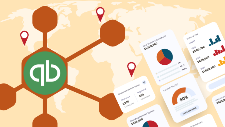
They are usually only thinking about the data visualization layer created in a tool like Looker Studio, Evidence, Power BI, or Apache Superset because that is the part they interact with.
The hidden assumption is that the right data will somehow already be there, clean, complete, and joined, which is rarely true without a proper stack behind it.
Why won’t a dashboard tool like Looker Studio or Power BI solve my reporting problems by itself?
A dashboard visualization tool on its own isn’t enough to solve your reporting needs because visualization tools are just the final layer of a business reporting dashboard. They sit on top of data that has already been ingested, stored, and modeled elsewhere.
Think of the visualization layer as the storefront: it is how people browse and “buy” answers, but the store only works if the logistics, inventory, and bookkeeping are already in place. Visualization tools take whatever tables you point them at and draw charts; they do not guarantee that those tables are complete, consistent, or even comparable across time.
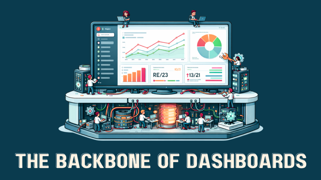
Before a chart can safely answer a question: data has to be pulled out of tools, landed somewhere durable, reshaped into a sensible model, and only then rendered. That entire chain from extraction to a decision-ready dashboard is the BI infrastructure.
If you wire your favorite BI tool directly to half a dozen SaaS exports and spreadsheets, you will get dashboards but those dashboards will fight each other. Slightly different definitions of “active customer,” mismatched time zones, and missing rows lead to charts that look polished but quietly disagree with each other, undermining confidence rather than increasing it.
What tools and people do I need to create a business dashboard?
To deliver a robust business dashboard, you need the following five components working together:
- Data engineer
- Data ingestion (ELT)
- Data warehouse
- Data analyst
- Data visualization platform
The data engineer and supporting data ingestion tools handle data extraction and loading from various SaaS and internal systems, while the warehouse provides a durable home where data can be standardized. On top of that, a data analyst uses the visualization platform to expose the data to the business in the reporting dashboard.
What does each role and tool behind my reporting dashboards do?
Here is what each of the five core components of a business reporting dashboard setup do to take you from raw SaaS data to a trustworthy dashboard your team can use:
- Data engineer – Connects your SaaS tools and databases, builds and maintains pipelines, and transforms raw data into clean, well-modeled tables that can be reused across many dashboards and analyses.
- Data ingestion – Continuously pulls fresh data from your tools via APIs, keeps schemas in sync, and updates the warehouse so dashboards stay accurate.
- Data warehouse/storage platform – Consolidates data from all your sources into a single source of truth, providing durable storage and fast querying so every report and dashboard is working from the same, consistent foundation.
- Data analyst – Defines business metrics, validates calculations, and makes sure dashboards answer real questions (revenue, churn, efficiency) instead of just displaying vanity numbers or disconnected charts.
- Data visualization platform – Presents metrics and insights in a usable way through dashboards with charts, tables, and interactive filters so stakeholders can quickly see what is happening and drill into details when needed.
Here’s a little more detail on the three technical components of your dashboard system and how they relate to each other:
The data ingestion layer
The first real problem is ingestion: systematically pulling data out of your stack of CRMs, billing systems, marketing platforms, support tools, and operational databases. This is where ELT comes in. Data is extracted from source systems and loaded into a central warehouse like BigQuery. It is then transformed using SQL and tools like dbt.
The data warehouse
Once data is flowing, it needs somewhere central to live. That is the job of the warehouse: systems like Google BigQuery that are built for analytical queries over large, evolving datasets. A warehouse decouples storage from compute, which means you can keep a lot of history and still query it quickly.
Practically, the warehouse is where you standardize reality. You define how customers, subscriptions, orders, and events are represented; you model metrics; you create a layer that downstream tools can all agree on. Done well, the warehouse becomes the canonical source for dashboards, ad hoc analysis, and even machine learning, because everyone trusts that the numbers in that environment obey the same rules.
The data visualization layer
Only after ingestion, warehousing, and semantics are in place can the data analyst add your visualization layer. Tools like Looker Studio, Power BI, Evidence, Superset, or a custom UI can sit on top of the same modeled data and semantic layer, giving different audiences views tailored to their responsibilities while still pulling from the same truth underneath.
The dashboard is a set of interactive views on top of a living data system. New questions mean adding or adjusting views, not ripping out and rebuilding pipelines. Changes in source systems are handled once in the ingestion and warehouse layers, then propagate to every downstream report automatically.
Why isn’t hiring one data analyst and buying a dashboard tool enough?
Hiring one data analyst and buying a dashboard tool is not enough because you are asking one person and one piece of software to do the job of an entire data system. A modern reporting setup needs data to be ingested, stored, modeled, governed, and then visualized, and those are different disciplines with different tools.
One person cannot cover the whole lifecycle
A single analyst is usually hired for querying and insight, but they end up being forced to act as engineer, modeler, and visualization specialist on top of that. This means they spend their days juggling exports, cleaning messy spreadsheets, and hand‑coding metrics inside dashboards instead of consistently answering high‑value business questions. As complexity grows—more SaaS tools, more teams, more metrics—the work becomes brittle and slow, and the entire reporting function is effectively “owned” by one overextended person.
A dashboard tool cannot fix bad or fragmented data
Dashboard and BI tools like Power BI, Looker Studio, or Tableau are designed to visualize data, not to fix the upstream problems with how that data is collected, structured, and stored. If the inputs are incomplete, inconsistent, or spread across disconnected systems, the dashboards will reflect that: they will look polished while quietly disagreeing on core numbers such as customers, revenue, or churn. Without proper ingestion pipelines and a warehouse acting as a single source of truth, each new dashboard becomes another bespoke integration held together by manual effort.
Do I need an in-house data team?
Most small and mid-sized businesses do not need an in-house data team. For several reasons, it just doesn’t make sense for these businesses to recruit, hire, train, and maintain a full team of data professionals.
Building a full in-house BI stack is overkill for most teams because it demands multiple hires, multiple platforms, and months or even quarters of implementation before leaders see real value. Small and mid-sized organizations rarely have the budget or appetite to fund dedicated engineers, analysts, and admins plus a warehouse, ELT tools, and BI licenses all at once.
How much should you expect to spend on the roles and tools behind your dashboards?
In most cases, a “do it yourself” setup with an engineer, an analyst, a warehouse, integrations, and a BI tool lands well into the hundreds of thousands of dollars per year once salaries, benefits, and platform fees are accounted for, even before you see reliable dashboards in production.
- Data engineer (people cost)
In the U.S., benchmark data shows average data engineer base salaries in the $120k–$135k/year range, with experienced engineers often higher, and realistic fully loaded costs (salary plus benefits, taxes, and overhead) frequently landing between $150k and $190k/year for a single engineer. That is the person responsible for building and maintaining your data pipelines, managing schemas, handling performance issues, and keeping the warehouse healthy. - Data analyst (people cost)
National salary benchmarks for data analysts typically fall around $80k–$90k/year in base pay, with many mid-level roles above that, which translates to roughly $100k–$130k/year once you include benefits and overhead. This role owns defining metrics, validating calculations, and turning your raw data into dashboards and stories that leaders can actually use. - Data warehouse / storage platform
Modern cloud warehouses like BigQuery charge separately for storage and queries, with published rates on the order of a few cents per GB per month for storage and around $5–$6.25 per TB scanned for on-demand queries, plus free tiers at low usage. For a small-to-mid business with tens to low hundreds of GB of analytical data and moderate querying, that often works out to tens to a few hundred dollars per month in direct warehouse fees—small compared with people costs, but still a recurring line item that grows with scale. - Visualization / BI platform
BI tools like Power BI have moved toward per-user and capacity pricing; for example, published changes have Power BI Pro at about $14 per user per month and Power BI Premium Per User around $24 per user per month, with capacity plans (such as a P1 node) starting near $4,995 per month. For a typical team of 10–20 people who need to build and consume dashboards, that can mean anything from a few hundred dollars per month in per-user licensing to several thousand per month if you move into capacity modes. - Ongoing integrations and ELT tools
Managed ELT and integration tools that keep your data flowing via APIs usually price by volume or tiers, with commonly cited ranges from roughly $100 to $1,250 per month on standard plans for lighter Stitch-type workloads up to several thousand dollars per month for higher-volume, multi-connector setups with tools in the Fivetran class. That spend is on top of the engineering time needed to configure, monitor, and troubleshoot those pipelines, which effectively makes integrations both a tooling and a people cost.
Executive cost overview
| Component | Typical annualized cost range (U.S.) | Notes |
| Data engineer (full-time) | ≈ $150k–$190k/year fully loaded. | Salary plus benefits/overhead for one engineer to own pipelines. |
| Data analyst (full-time) | ≈ $100k–$130k/year fully loaded. | Salary plus benefits/overhead for one analyst to own reporting. |
| Data warehouse (e.g., BigQuery) | ≈ $1k–$5k/year for small–mid volumes. | Depends on data size and query volume; people time is extra. |
| BI / visualization tool | ≈ $2k–$10k/year for small teams. | Based on per‑user licensing and/or entry-level capacity tiers. |
| Integrations / ELT tools | ≈ $1k–$15k+/year depending on volume. | Grows with data volume and number of connected sources. |
Cost Details
| Component | One-time / Setup costs (illustrative) | Recurring costs (illustrative) | Notes |
| Data engineer (full-time hire) | Recruiting + onboarding time (often several weeks to months) | Base salary typically around $120k–$135k/year; fully loaded cost often $150k–$190k/year in the U.S. | Owns pipelines, performance, and reliability of the data foundation. |
| Data analyst (full-time hire) | Recruiting + onboarding time | Base salary often $80k–$90k/year; fully loaded cost commonly $100k–$130k/year. | Owns metric definitions, validation, and dashboard/insight creation. |
| Data warehouse / storage (e.g., BigQuery) | Initial schema design, modeling, and configuration by engineering time | Storage on the order of $0.02–$0.04 per GB per month; queries around $5–$6.25 per TB scanned, with free tiers. | Central “source of truth” for analytics; cost scales with data volume and query usage. |
| Visualization / BI platform (e.g., Power BI) | Initial workspace setup, data source connections, and model wiring | Per-user licenses such as Power BI Pro at about $14/user/month and Premium Per User around $24/user/month; capacity (e.g., P1) near $4,995/month. | Cost grows with number of creators/viewers and, at scale, with capacity needs. |
| Integrations / ELT tools (APIs, syncs) | Connector setup and testing time per source | Managed ELT tools often range from roughly $100–$1,250/month on standard tiers, with higher-volume plans in the thousands per month. | Pricing is tied to data volume and number of sources; still requires monitoring and oversight. |
When you add these pieces together—even conservatively—a minimal in-house stack often easily exceeds $250k–$300k per year in combined salaries and platform fees, plus months of ramp time before everything works smoothly.
How can I get proper dashboards and reporting without building my own data department?
At one extreme, you have “one analyst and a BI tool.” At the other, a fully staffed internal data team plus a modern stack—ELT pipelines, BigQuery or similar, multiple visualization tools.
Most organizations BlinkMetrics talks to live in the gap between those extremes: too complex for the first scenario, nowhere near ready to fund the second.
A fractional data team with its own stack solves this problem by letting you rent a complete BI system—people plus platform—without building it yourself.
Instead of hiring and coordinating engineers, analysts, and tool vendors, you connect your systems once and let the fractional team handle ingestion, warehousing, modeling, and visualization as an integrated service. You still get the experience of working with humans who understand your business, but at an engagement level sized to your stage and budget.
How BlinkMetrics’ fractional data team solves the whole data and reporting problem, not just the dashboards
BlinkMetrics’ fractional data team solves the whole data and reporting problem by providing the visualization platform, data warehousing, data pipeline, and expert data team as a managed service.
Instead of asking you to choose between hiring a data analyst, a data engineer, or buying another BI tool, BlinkMetrics brings all of those capabilities together in one offering so you are plugging into a working system, not funding an experiment.
The team connects your SaaS apps, sets up and runs the API-driven data pipelines, maintains a centralized data warehouse, and delivers dashboards built around your real business questions.
You see meaningful results in weeks, not quarters, because the patterns, infrastructure, and playbooks are already in place instead of being designed from scratch for the first time.
If you are ready to move beyond “we just need a dashboard” and actually get a reporting system your team can trust, schedule a strategy call with BlinkMetrics and meet your fractional data team.
Questions business leaders ask about fractional data teams and dashboards
Is a data strategy call worth my time as a busy business leader?
A data strategy call is worth your time if you are feeling ongoing pain around reporting, dashboards, or “not trusting the numbers,” because it quickly shows what it would take to fix those issues without committing to a full project. In 30–45 minutes, a good strategy call should map your current tools and spreadsheets to a simple plan, clarify whether you are a fit for a fractional data team, and outline timelines and budget so you can make an informed decision.
Will a fractional data team work if our data is messy and spread across tools?
A fractional data team is specifically designed for companies whose data is messy and spread across multiple SaaS tools, databases, and spreadsheets. Instead of requiring a pristine warehouse up front, the team’s job is to connect to your existing systems, normalize the data, and deliver a first version of reliable reporting that can improve over time.
How does a fractional data team compare to hiring my own data analyst or data engineer?
A fractional data team combines the skills of a data engineer, data analyst, and BI specialist plus the supporting platforms, whereas an individual hire gives you just one role. For many organizations, the fully loaded annual cost of a single in-house engineer or analyst is comparable to, or higher than, the cost of a fractional team that brings a complete data and reporting setup, proven patterns, and faster time-to-value.
Will working with a fractional data team lock me into an expensive long-term contract?
Working with a fractional data team does not have to lock you into an expensive long-term contract if the engagement is structured around clear milestones and transparent pricing. The strategy call should define the scope, expected outcomes in the first few weeks, and options to continue, scale, or stop based on concrete results rather than vague promises.
Will a fractional data team replace or disrupt my existing team?
A fractional data team is intended to support and extend your existing team, not replace them, by taking over the heavy lifting on pipelines, warehousing, and modeling. If you already have an analyst, the fractional team can give them better foundations so they spend more time answering questions and less time fighting spreadsheets; if you do not, the team temporarily fills that gap until you are ready to hire in-house.
Will a fractional data team force us to change all our tools and workflows?
A fractional data team typically works with the tools you already use—CRM, billing, marketing, support—and connects to them through APIs and integrations rather than forcing you to rip and replace systems. The main change your staff experiences is on the reporting side: fewer ad hoc spreadsheets, more consistent dashboards, and a clearer set of shared metrics.
How can I be sure my data will be secure with a fractional data team?
You can assess data security with a fractional data team by asking how they handle access control, credential storage, encryption, and audits, and by checking that they follow standard practices such as least-privilege access and encrypted connections. A credible provider should be able to explain their approach in plain language, align with your existing security policies, and document what happens to your data and connections if the engagement ends.
How long does it take to get useful dashboards from a fractional data team?
Most organizations should expect to see initial, useful dashboards from a fractional data team within a few weeks rather than months, starting with the most critical metrics and systems. The typical sequence is: connect core tools, land data in a central store, ship an initial set of executive dashboards, and then iterate, so each new question builds on the foundations already in place.
Sources
- Data engineer salary benchmarks
- Built In – “2025 Data Engineer Salary in US” (average and range for U.S. data engineers).
- Talent.com – “Data engineer: Average Salary in United States of America, 2025” (national averages and high-end salaries).
- Salary.com – “Data Engineer Salary | Salary.com” (average base and total compensation as of late 2024/2025).
- Data analyst salary benchmarks
- Data warehouse / BigQuery pricing
- Visualization / BI tool pricing (Power BI)
- Integrations / ELT tool pricing (Stitch, Fivetran, etc.)
- Estuary – “Fivetran vs Stitch: In-Depth ETL Tool Comparison” (pricing tiers and example monthly ranges for Stitch and Fivetran).
- Stitch – “Fivetran vs. Stitch – Compare features, pricing, services, and more” (Stitch plan ranges and usage-based pricing context).
- Fivetran – “Fivetran vs Stitch: Performance, Pricing, and More” (Fivetran pricing model and typical cost per volume).