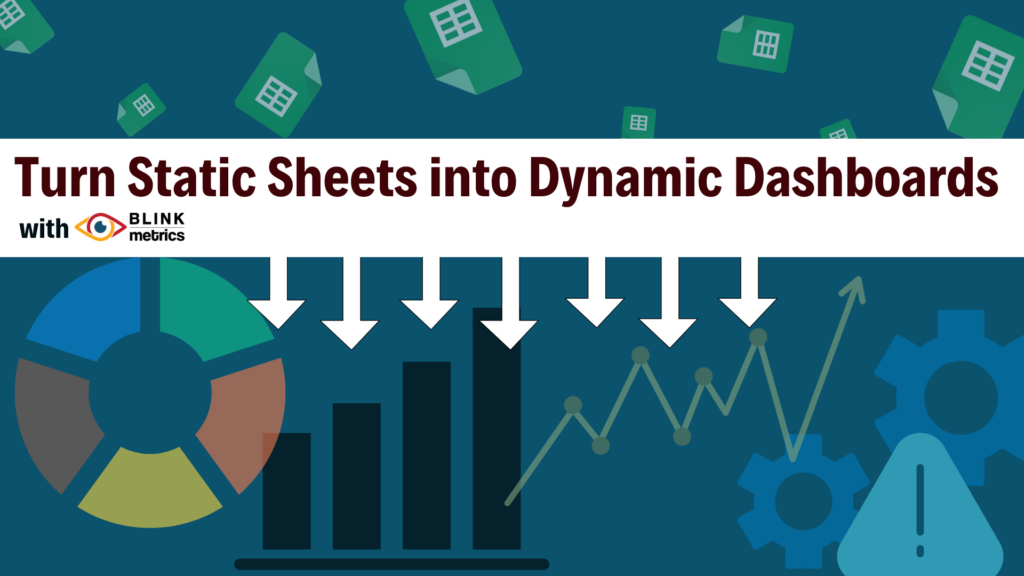
Google Sheets dashboards work well for basic reporting but as your team’s needs evolve, their limits become obvious. The formulas break, the layout shifts, and you realize you can’t integrate data from all your other tools in one place. That is the moment when you need a Google Sheet visualization tool like BlinkMetrics that takes you beyond spreadsheets and into connected, interactive dashboards.
Why Google Sheets dashboards fall short for data visualization
Google Sheets is a fantastic entry point for collecting and charting data, but building executive-ready dashboards or automating reports in Google Sheets quickly becomes tedious and fragile. The more your data grows, the more time you spend maintaining charts instead of using insights to make decisions.
Here’s why Google Sheets is limited as a Google Sheet visualization tool:
- Limited chart types. Google Sheets does not support advanced charts that reveal complex relationships at a glance such as sparklines, image charts, or other advanced graphs
- Restricted filterability. It is hard to build visuals that filter cleanly by multiple criteria, such as date ranges plus individual people or other category fields.
- Customization extremes. Analysts often find there are too few configuration options, while executives are overwhelmed by too many knobs and settings when they just want clear takeaways.
- No deep analytics. Forecasting, regression models beyond simple trendlines, and confidence intervals require manual formulas or external tools.
- Not a full-featured dashboard tool. Google Sheets offers fewer interactive or dynamic dashboard controls than dedicated business intelligence platforms.
- Fragile dashboards. Insert or delete a row or column in the wrong place and dynamic chart ranges can silently break, leading to incorrect visuals.
- Data integrity risks. Complex formula-based visuals like sparklines or image charts require advanced knowledge and can be difficult for teams to audit or modify.
- Automation & advanced visualizations barriers. Script-based automation demands technical expertise that many teams do not have time or capacity to develop.
- Single data source limitations. You cannot easily blend multiple Google Sheets or connect them to your CRM, eCommerce, finance, or operations tools in a single, unified visualization.
BlinkMetrics: The Google Sheet visualization tool that connects all your data
BlinkMetrics is a done-for-you data visualization platform that automates dashboards, blends multiple data sources, and helps businesses go beyond the limits of Google Sheets while still using Sheets as a familiar foundation. With the BlinkMetrics Google Sheets data source, you can connect one or more spreadsheets directly to a custom reporting workspace.
Here’s how BlinkMetrics transforms your Google Sheets dashboards into a true Google Sheet visualization tool:
- Connect more, visualize effortlessly. Blend one or more Google Sheets with CRM, marketing, financial, and operational data in a single custom reporting dashboard built for you.
- Filter dynamically. Visualize your data for any selected date range and slice by person, team, or other category fields using intuitive controls.
- Visualize beyond basic charts. The BlinkMetrics team can implement advanced visualizations, including sparklines, image-based visuals, layered time series, and more.
- Stay dynamic. Dashboards update automatically, eliminating manual refreshes and broken ranges.
- Collaborate effortlessly. Share dashboards that anyone can explore, drill into, and understand without needing to write or maintain formulas.
- Tell the complete story. Move from numbers in cells to visual narratives that highlight performance, trends, and opportunities across the entire business.
Often going the full-time internal data team route is impractical, inefficient, and leaves you with less capital available to act on data insights the team uncovers.
Who BlinkMetrics is for
BlinkMetrics is built for teams that have outgrown basic Google Sheets charts but do not want to build and maintain a full BI stack themselves. It is especially useful for operators, finance leaders, and founders who rely on spreadsheets every day and now need an executive-ready Google Sheet visualization tool that just works.
Typical customers include small to mid-sized businesses, eCommerce brands, and service companies that already use Google Sheets as a central data hub for metrics, forecasts, and reporting. BlinkMetrics helps these teams turn existing spreadsheets into a connected dashboard layer that blends Google Sheets with CRM, marketing, finance, and operations data.
BlinkMetrics is also a strong fit for teams juggling multiple spreadsheets, manual reporting, and broken formulas who need a done-for-you way to see performance across the business in one place—without giving up the familiarity of Google Sheets.
Take your Google Sheets dashboard to the next level
If you have pushed Google Sheets dashboards to their limit but feel overwhelmed by heavy DIY BI software like Power BI or Looker Studio, BlinkMetrics fills the gap.
You keep the simplicity and familiarity of Google Sheets as your underlying data source while gaining the sophistication of a scalable, cloud-based data visualization tool that is set up and maintained for you.
It is the best of both worlds: Google Sheets flexibility meets automated, interactive reporting in a done-for-you custom reporting dashboard.
How to connect Google Sheets directly to a data visualization tool
A Google Sheet visualization tool like BlinkMetrics connects directly to Google Sheets and turns static spreadsheets into interactive dashboards without requiring you to rebuild everything from scratch. The connection allows your existing data models to power more advanced, multi-source visualizations.
Seeing an interactive dashboard is often the moment when Google Sheets users realize how much more their data could be doing for them. When static charts become live, connected visualizations, it becomes easier to spot trends, outliers, and opportunities across tools in a single view.
If your current Google Sheets charts feel limited, a short walkthrough can clarify what is possible when those same sheets power interactive dashboards. On a demo call, you can see how BlinkMetrics connects one or more Google Sheets to your other business tools and turns them into intuitive, executive-ready visuals tailored to your metrics.
During your BlinkMetrics demo, you can:
- Watch multi-source data from Sheets and other platforms come together in one visual workspace.
- Explore examples tailored to roles like operations, finance, and eCommerce so the visuals reflect real questions your team asks every week.
- Ask how your existing reports could translate into more flexible, automated visualizations without rebuilding your data from the ground up.
Book a BlinkMetrics demo to see what your Google Sheets data looks like when it is part of a connected, interactive visualization layer for your entire business.
FAQ: Google Sheet visualization tool & BlinkMetrics
A Google Sheet visualization tool is a platform that connects directly to Google Sheets and transforms spreadsheet data into interactive dashboards, charts, and reports without requiring users to rebuild their data from scratch. It lets teams keep Sheets as their familiar data source while gaining more powerful visuals, filters, and analytics than Google Sheets can provide on its own.
BlinkMetrics connects one or more Google Sheets to a custom reporting workspace and blends them with data from other tools such as CRMs, marketing platforms, and finance systems. The result is a done-for-you dashboard experience where you can filter by date ranges and categories, visualize more advanced chart types, and see multi-source performance stories without maintaining complex formulas.
No. BlinkMetrics is designed as a done-for-you solution, so your team does not need to write scripts or manage complex data models. You keep updating your Google Sheets as usual, and BlinkMetrics turns that data into executive-ready dashboards with the filters, visuals, and interactions you specify.
It is time to move beyond native Google Sheets charts when you are spending more time fixing formulas and layouts than making decisions, or when you need to combine multiple Sheets and tools into one coherent view. At that point, a dedicated Google Sheet visualization tool like BlinkMetrics helps you reclaim time, reduce errors, and get clearer visibility into how the business is performing.