QuickBooks Online includes some basic charts, but it can’t turn multi‑location P&L by class into rich, interactive dashboards for stakeholders who don’t think in spreadsheets. For multi-location businesses (dental practices, franchises, service companies with multiple offices), you need a reporting layer that pulls from QBO and displays financial KPIs graphically.
What QuickBooks can and can’t do for multi-location reporting

QuickBooks handles multi-location accounting well. You can:
- Track locations as classes or locations – separate P&L by office, region, or business unit
- Run comparison reports – view P&L by class with month-over-month or year-over-year columns
- Filter by location – drill into individual office performance
- Export to Excel – pull raw data for further analysis
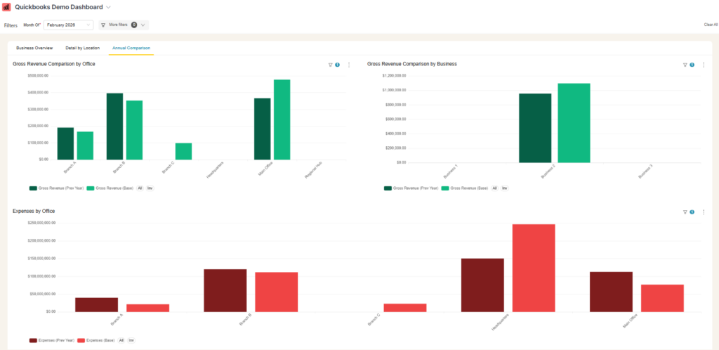
What’s missing: robust, multi‑location dashboards. QuickBooks’ built‑in visuals are limited and don’t give you stacked bar charts by location, waterfall charts by office, or multi‑location cash‑flow trend lines in one place.
For operators who live in the P&L, this is fine. For founders, partners, and board members who need to understand performance at a glance, it’s a problem.
The “visual stakeholder” problem
Multi-location businesses often have two types of financial consumers:
| Role | How they process financial data |
|---|---|
| Operators/COOs | Read P&L line by line, understand the structure, see the story in the numbers |
| Founders/Partners/Board | Need visual summaries, can’t parse dense spreadsheets, want to see trends at a glance |
The operator understands the P&L. The visionary founder looks at a spreadsheet and their eyes glaze over.
This gap becomes more pronounced as you grow:
- Bringing in partners who need to understand their location’s performance
- Adding new locations where comparisons matter more
- Quarterly reviews where you need to present financials clearly
- Year-end reporting to stakeholders who aren’t in the day-to-day
Operators end up spending hours translating P&L data into slide decks, manually rebuilding charts each month from fresh QuickBooks exports. That’s time you don’t have.
What a multi-location QuickBooks dashboard should include
Based on what multi-location operators actually need to present, here’s a practical scope for a QBO dashboard:
Office-level views
| Chart type | What it shows |
|---|---|
| Revenue by business line | Stacked bars per month showing revenue breakdown (e.g., different service types) |
| Expenses by category | Stacked bars showing expense categories with revenue line for context |
| Cash flow | Inflow/outflow bars with net cash flow trend line |
| Net income trend | Line chart showing profitability over time |
Company-level views (all locations)
| Chart type | What it shows |
|---|---|
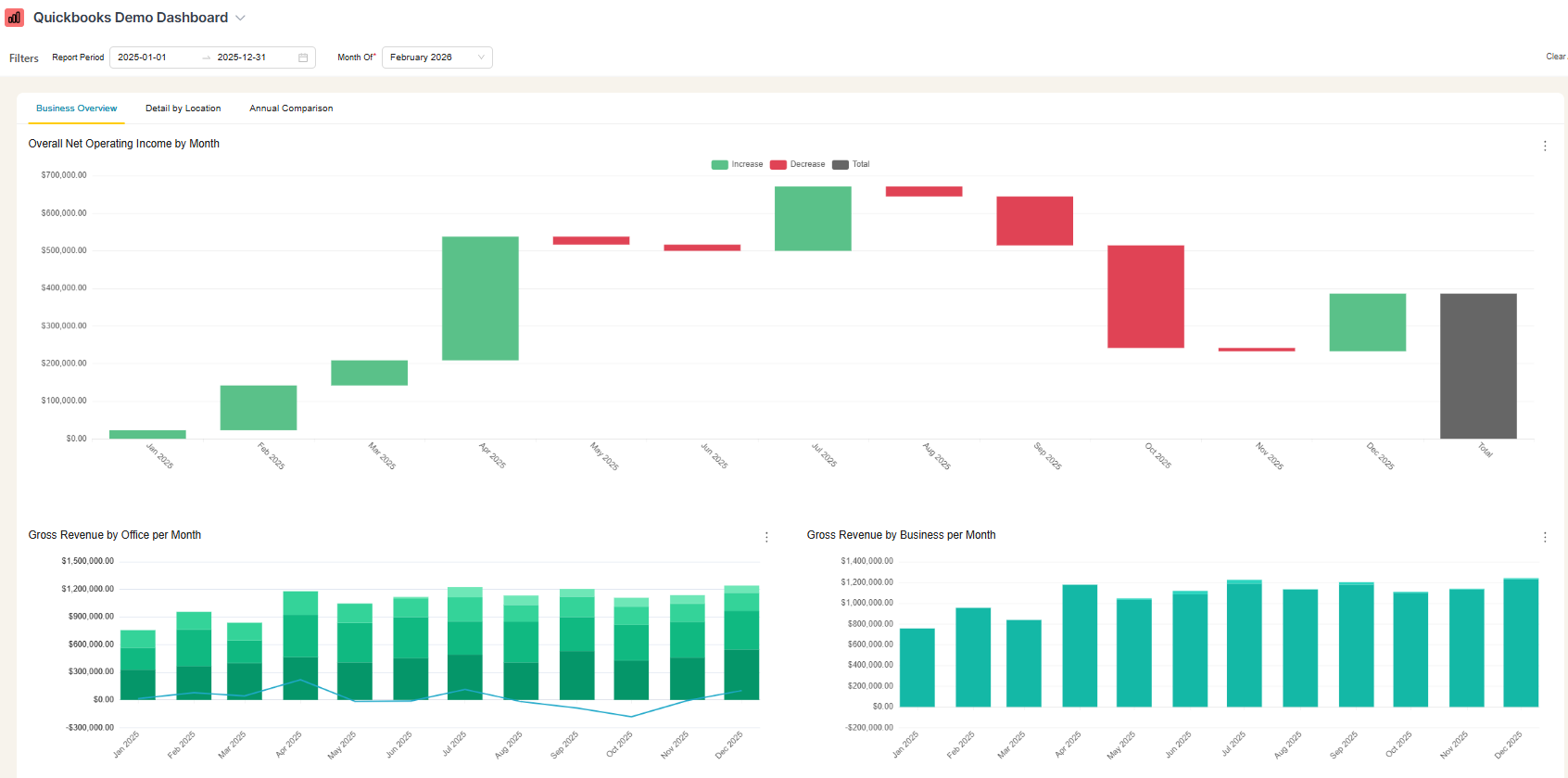
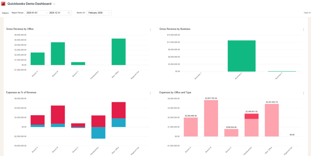
| Net income waterfall | Each office as a bar, rolling up to total company net income |
| Revenue by office | Stacked by business line, showing composition |
| Expenses as % of revenue | By location, showing efficiency differences |
| Cash flow by office | Inflow/outflow with net line at company view |
Comparison views
- This month vs. last month vs. same month last year – by office
- Revenue by business line – same comparison structure
- Expenses as % of revenue – benchmarking across locations
These views answer the questions stakeholders actually ask: “How did each office perform? Where are we improving? Which location is most efficient?”
How to build a QuickBooks dashboard
A dashboard build involves more than just the visible reporting layer. You also need the data and reporting system behind it. Here are your three main dashboard set-up and hosting options, each with different tradeoffs:
Option 1: Power BI
- ~$15–$25 per user/month depending on Pro vs Premium licensing (often a few seats minimum in practice)
- Requires separate data hosting (~$200/month for the database)
- No native Power BI connector for QuickBooks Online, so you either build a data pipeline or pay for a third‑party connector
- Per-user costs add up if partners or office managers need access
Best for: Organizations already invested in Microsoft ecosystem with internal BI resources.
Option 2: Self-hosted open source (ex: Superset)
- ~$100/month hosting costs
- No per-user fees (unlimited viewers)
- Requires building the QBO data pipeline yourself
- You maintain the infrastructure and connector
Best for: Technical teams comfortable with data engineering who want full control.
Option 3: Done-for-you dashboard service
- Fixed monthly cost including connector, hosting, and dashboards
- Auto-syncs from QuickBooks (weekly or daily)
- No per-user fees
- Someone else maintains the pipeline when QBO’s API changes
At BlinkMetrics, we built exactly this: a managed QuickBooks connector that syncs your P&L, classes, and chart of accounts into a data warehouse, then delivers dashboards through Apache Superset. Operators don’t have to pull anything manually. The data flows automatically, and the dashboards stay current.
Curious what this looks like in a real-world business? Here’s how BlinkMetrics helped Kids2Dentist turn QuickBooks data into founder-friendly financial storytelling.
Which option fits?
| Factor | Power BI | Self-hosted | Done-for-you |
|---|---|---|---|
| Monthly cost (3 users) | ~$300+ | ~$100 | ~$199 |
| Per-user fees | Yes | No | No |
| QBO connector included | No | No | Yes |
| Maintenance required | Medium | High | None |
| Time to first dashboard | Weeks | Weeks | ~2 weeks |
For most multi-location businesses under $10M revenue, the done-for-you option eliminates the labor issue entirely. You stop pulling exports. You stop rebuilding charts. You just present.
Making It work with your QuickBooks structure
A few things to get right in QuickBooks before building dashboards:
Use classes or locations consistently for locations. Each office should be a class or location (e.g., “Corporate,” “Location – Visalia,” “Location – Fresno”). This is how most multi-location businesses already set up QBO.
Separate business lines in your Chart of Accounts. If you have multiple service lines (like a dental practice with general, ortho, and oral surgery), create accounts for each. Even if some are empty now, the structure enables future reporting.
Use summary accounts for expense categories. Group detailed expense lines under summary accounts (People, Supplies, Corporate). This makes dashboards cleaner and comparisons meaningful.
Plan for multi-entity scenarios. If you’re restructuring multiple locations into separate LLCs, keep your Chart of Accounts and class structure consistent across entities. This lets you clone dashboards to the new QBO org without rebuilding everything.
Summary
QuickBooks Online handles multi-location accounting through classes or locations and tracks your P&L accurately. What it can’t do is visualize that data for stakeholders who need to see performance at a glance.
For operators presenting to founders, partners, or boards, the gap between “data exists in QuickBooks” and “data is understandable by non-operators” requires a reporting layer. Whether you build it yourself in Power BI, self-host an open source tool, or use a managed service, the goal is the same: dashboards that auto-update so you stop spending hours on manual exports.
QuickBooks Online shows basic charts on the dashboard and, in some tiers, lets you add custom charts. However, it doesn’t natively give you multi‑location dashboards like stacked revenue by location, net income waterfalls by office, or cross‑location comparisons, so most teams still need an external tool.”
Use classes (or locations, depending on your setup). Create a class for each location and assign transactions accordingly, then run Profit and Loss by Class to see each location’s performance. Class tracking is available in QuickBooks Online Plus and Advanced.
It depends on your resources. Power BI works if you’re in the Microsoft ecosystem and have BI staff. Self-hosted Superset works if you’re technical and want no per-user fees. Done-for-you services like BlinkMetrics work if you want automatic syncing without maintaining infrastructure.
Yes, but not within QuickBooks itself. You’ll need an external tool that connects to QuickBooks via API, pulls your data on a schedule (daily or weekly), and generates reports automatically. This eliminates the manual export-and-rebuild cycle.
Build dashboards with charts instead of tables. Stakeholders who don’t read P&Ls need stacked bar charts (revenue by location), waterfall charts (net income contribution by office), and trend lines (performance over time). Either build these manually in slides each month, or connect a dashboard tool that generates them automatically.