
Every project manager knows the challenge: work is happening across multiple teams and projects, but getting a clear picture of status, progress, and bottlenecks requires opening a dozen tabs and piecing together information manually. Asana dashboards are designed to solve this. They give you visual summaries of project data (task completion, workload distribution, status breakdowns) so you can see what matters without digging through individual tasks.
This guide covers everything you need to know about Asana dashboard options, from project-level views to portfolio rollups. You’ll learn how to create dashboards step by step, understand what Asana’s native dashboards can and can’t do, and discover when external tools might fill the gaps.
Understanding Asana’s native dashboard options
Asana provides three distinct dashboard types, each serving different visibility needs. Knowing which one fits your situation saves time and frustration.
Project dashboards
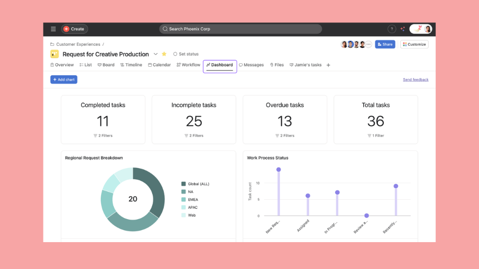
Every Asana project includes a Dashboard tab. This is your primary tool for visualizing work within a single initiative. Project dashboards let you add widgets showing:
- Task completion over time (line or burn-up charts)
- Tasks by section, status, or assignee (column/bar, donut, or lollipop charts)
- Custom field breakdowns (for any dropdown or number field you’ve created)
- Numeric totals (incomplete tasks, due soon, overdue) via number widgets
Project dashboards refresh when you open them, pulling the latest task data. They’re ideal for sprint tracking, campaign management, or any scenario where you need progress visibility on one specific project.
Portfolio views
Portfolios group multiple projects together and provide a higher-level status view. Portfolio views (list, timeline, status, and workload tabs) display:
- Project health indicators (on track, at risk, off track)
- Status update summaries from project owners
- Timeline views showing project start and end dates
- Progress rollups based on task completion
Leadership teams use portfolio views to monitor programs without opening each project individually. You can also include portfolio-level data in reporting dashboards using Universal Reporting. The catch is that portfolio views focus on project-level status, not task-level detail.
Reporting dashboards
If your plan includes Universal Reporting, you can create reporting dashboards made up of charts that pull data from tasks, projects, or goals across multiple teams. With reporting dashboards, you can:
- Create charts that pull data from tasks, projects, or goals across multiple teams
- Visualize custom fields consistently across different initiatives
- Build workload-style reports showing effort distribution by team member
- Filter by date ranges, assignees, teams, or any custom field
Reporting dashboards offer the most flexibility for cross-project analytics. You can save reports and share them with stakeholders who need visibility without full project access.
How to create an Asana dashboard
Here’s the step-by-step process for setting up each dashboard type.
Creating a project dashboard
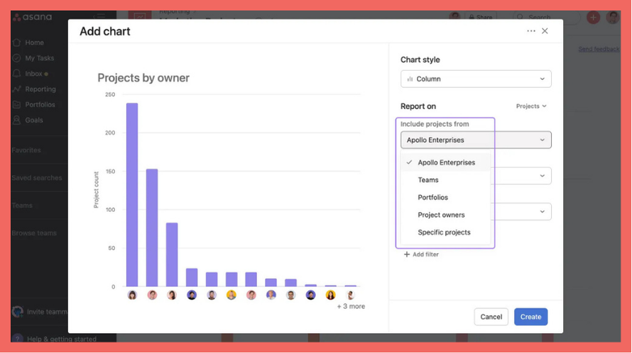
- Open the Asana project you want to track
- Click the Dashboard tab in the project header (next to List, Board, Timeline, etc.)
- Click Add chart in the top-right corner
- Select a chart type: column/bar, line, burn-up, donut, lollipop, or number
- Choose what to measure (task count, effort where available, or a custom field)
- Configure grouping (by status, section, assignee, or custom field)
- Name your widget and click Add to dashboard
Repeat this process to add multiple widgets. Most project dashboards benefit from 3-5 charts covering completion status, assignee workload, and at least one custom field breakdown.
Tip: Drag widgets to rearrange them. Put the most important metrics at the top where stakeholders will see them first.
Setting up portfolio views
- Navigate to Portfolios in the left sidebar
- Click Create portfolio (or open an existing one)
- Add projects using the Add project button
- Configure columns to display relevant custom fields (status, owner, dates)
- Click the Status tab to see project health rollups
- Use the Workload tab to see team capacity across all portfolio projects
For portfolio views to work well, ensure your projects have regular status updates. Asana uses these updates to calculate project health indicators.
Configuring dashboard widgets
Common widget types and when to use them:
| Widget Type | Best For | Limitations |
|---|---|---|
| Line or burn-up chart | Tracking completion or workload trends over time | Less effective when you only have a few data points |
| Column/bar chart | Comparing categories (by assignee, section, status, or any categorical field) | Gets crowded with 10+ categories |
| Donut or lollipop chart | Showing distribution at a glance (e.g., status or priority mix) | Less useful when you have many small slices |
| Number widget | Surfacing a single key metric prominently (e.g., overdue tasks, open bugs) | Needs supporting charts for context |
Most effective dashboards combine a trend line (completion over time) with one or two comparison charts (by status, by assignee) and a number widget for the most critical metric (like overdue count).
Asana dashboard limitations you should know
Native Asana dashboards handle single-project visibility well. But most teams hit walls when their needs grow. Understanding these limitations upfront helps you plan accordingly.
Cross-project visibility gaps
Project dashboards only show data from one project. If you manage work across five client projects or coordinate three product teams, you can’t create a single dashboard that aggregates all of them.
Universal Reporting lets you aggregate multiple projects into one dashboard, but each chart still focuses on a single metric at a time and there are limits on how many projects you can include per dashboard. Very large portfolios may require multiple dashboards. There’s no unified “portfolio KPI scorecard” that treats your entire body of work as one dataset.
No historical data tracking
Asana dashboards show current state plus trends over a selected period (for example, task completion over recent weeks). But they don’t maintain arbitrarily queryable historical snapshots.
This means you can’t easily ask:
- “How did this week’s velocity compare to last month’s average?”
- “What did this dashboard look like on January 15th?”
- “What was our on-time delivery rate last quarter?”
You can see trends over a selected range, but not query any arbitrary past date or compare this quarter to last using only native history.
Limited customization options
Asana provides several chart types (column/bar, line, burn-up, donut, lollipop, and number). If your plan includes formula custom fields, you can calculate KPIs like percentages, ratios, or budget variance directly in Asana projects and portfolios.
However, you still can’t easily build highly customized, multi-metric scorecards with complex formulas and layout control the way you can in dedicated BI tools. Other gaps include:
- Conditional formatting based on thresholds
- Charts combining data from Asana and other tools
- Complex cross-tool KPI models
If your stakeholders expect highly polished KPI dashboards with complex calculations across tools, you’ll either model more logic in formula custom fields or export data into spreadsheets/BI tools to finish the analysis.
Refresh and real-time issues
Dashboard data updates when you load the page, but it’s not real-time streaming. If you’re watching a dashboard during a critical push, you need to manually refresh to see the latest changes.
For most reporting use cases this is fine. For live monitoring during crunch time, it’s a gap.
Advanced Asana dashboard strategies
Before looking outside Asana, there are power-user techniques that extend what native dashboards can do.
Using Goals for KPI tracking
Asana Goals (available on select paid plans) let you define objectives and track progress based on linked projects, tasks, or sub-goals, and you can now add custom fields to goals for richer reporting.
- Create a Goal for your key outcome (e.g., “Launch Q2 feature release”)
- Link relevant projects to the Goal
- Set the progress method (automatic from sub-goals or manual)
- View Goal progress in the Goals tab
Goals work well for milestone-based KPIs and simple percentage-complete metrics. They’re still less suited to complex, calculated metrics like detailed velocity models or utilization formulas that span multiple data sources.
Portfolio status overviews
Combine portfolios with consistent status update practices to create pseudo-dashboards for leadership:
- Standardize status update format across project owners
- Use the Status tab to see all updates in one view
- Filter by date to surface recent changes
This approach works when stakeholders care about narrative context (“what’s the situation?”) more than raw numbers.
Combining dashboards with Advanced Search
Saved searches give you dynamic lists that complement dashboard visuals:
- Create a search for “tasks due this week, not completed”
- Save it for quick access
- Reference it alongside your dashboard to drill into specifics
Dashboards show the numbers; saved searches help you take action on them.
Enhancing Asana dashboards with external tools
When native capabilities hit their ceiling, external reporting tools fill the gaps. Here’s how to evaluate whether you need one.
When to consider third-party dashboard tools
Consider external options if you:
- Need cross-project KPI dashboards treating your workspace as a unified dataset
- Want historical snapshots you can query by date
- Require calculated metrics like on-time delivery rate, velocity, or utilization
- Must combine Asana data with data from Jira, HubSpot, or other tools in one view
- Track planned vs. actual variance (baseline scope vs. what actually shipped)
If you only need current-state visibility within individual projects, Asana’s native dashboards will serve you well.
What to look for in an Asana dashboard integration
Not all third-party tools are equal. Key capabilities to evaluate:
- Multi-project aggregation — Can it pull from all your Asana projects into unified metrics?
- Historical tracking — Does it store daily or weekly snapshots for trend analysis?
- Calculated KPIs — Can you define custom formulas, not just raw counts?
- Multi-source support — If you use Jira, HubSpot, or Google Sheets alongside Asana, can you combine them in one dashboard?
- Automated refresh — Does data update automatically, or do you export manually?
How BlinkMetrics solves these gaps
BlinkMetrics is purpose-built for teams who’ve outgrown native reporting. It connects to your Asana workspace and unlocks capabilities Asana doesn’t offer:
- Cross-project dashboards — Aggregate data from every project in your workspace into unified views
- Historical snapshots — Daily data capture lets you track trends over weeks, months, or quarters
- Calculated KPIs — Build custom formulas like on-time delivery rate, throughput per person, or utilization percentage
- Multi-source dashboards — Combine Asana with Jira, HubSpot, Google Sheets, and 50+ other tools in one view
- Planned vs. actual reporting — Track variance between original plans and actual delivery
Conclusion
Asana dashboards give you solid project-level visibility out of the box. Project dashboards, portfolio views, and Universal Reporting cover the basics: task completion, status distribution, workload views, and cross-project charts.
Where teams hit walls is advanced reporting: historical snapshots for trend analysis, calculated KPIs with custom formulas, and multi-source dashboards that combine Asana with other tools. If your needs stay within single projects and current-state visibility, native dashboards work well. Once you’re asking for historical comparisons, portfolio-wide KPIs, or multi-tool views, it’s time to look at dedicated reporting tools.
Ready to go beyond native Asana dashboards? See how BlinkMetrics creates the cross-project, historical, and KPI dashboards that Asana can’t →
Related guides
- Asana dashboard examples — 13+ templates and ideas for your team
- Asana KPI dashboard — how to track key metrics
- Team empowerment — What can an Asana dashboard empower your team to do?
Asana dashboards give teams visibility into work status without opening individual tasks. You can track completion progress, see workload distribution, identify bottlenecks by section or status, and share visual summaries with stakeholders. Project dashboards focus on single initiatives; portfolio views provide leadership-level oversight across multiple projects.
Yes, using Universal Reporting or portfolios. Universal Reporting lets you build dashboards whose charts pull data from multiple projects, and portfolios provide rollup views across grouped projects. However, there’s no native portfolio KPI dashboard with highly flexible, cross-tool formulas or long-term historical snapshots. For cross-project scorecards with custom formulas, teams typically use external tools like BlinkMetrics.
Depending on your plan, Asana offers Goals, Universal Reporting, and formula custom fields that support basic KPI tracking. Goals link work to objectives and show progress percentages. Formula custom fields let you define some KPIs directly in projects and portfolios. However, native Asana KPI dashboards still don’t support very advanced KPI modeling (for example, complex on-time delivery formulas across tools or multi-metric scorecards with custom layouts), so many teams use external reporting tools for those needs.
Project dashboards visualize task-level data within a single project: completion over time, status breakdowns, and assignee workload. Portfolio views aggregate project-level data across multiple initiatives: health status, milestone timelines, and progress summaries. Use project dashboards for daily team visibility; use portfolio views for executive reporting on program status.
Native dashboards show current state plus trends over a selected period (for example, task completion over recent weeks). They don’t maintain arbitrarily queryable historical snapshots. You can’t easily ask “what did this look like on January 15th?” or compare this quarter to last quarter using only native history. For true historical tracking, export data regularly to spreadsheets or use a reporting tool that captures daily snapshots.