If you’ve searched this exact question, you might be studying for Asana certification. That or you’re a team lead wondering whether native Asana dashboards deliver the visibility your team needs.
Either way, here’s the short answer: Asana dashboards empower your team to see work status at a glance, balance workload across team members, track progress toward goals, and communicate status to leadership without manual updates.
That’s the certification answer. Keep reading for the practical reality of what “team empowerment” actually looks like, where it works well, and when you’ll need more.
The quick answer (for Asana certification seekers)
What can an Asana dashboard empower your team to do?
Asana dashboards empower teams to:
- Visualize task completion and project progress at a glance
- See task distribution by assignee to identify imbalances
- Track goal progress and milestone achievement
- Share visual project status with stakeholders who have Asana access
- Spot bottlenecks by section, status, or assignee
If you’re here for the certification, that’s your answer. Keep reading for what this means in practice.
What “team empowerment” actually looks like
Visibility without status meetings
When your project has a dashboard, team members can check it themselves. No need to ping someone asking “where are we on this?”
The real empowerment here is time saved and context preserved. Project status meetings exist because people lose track. Dashboards keep the picture visible without requiring everyone to stop and talk about it.
Task distribution visibility
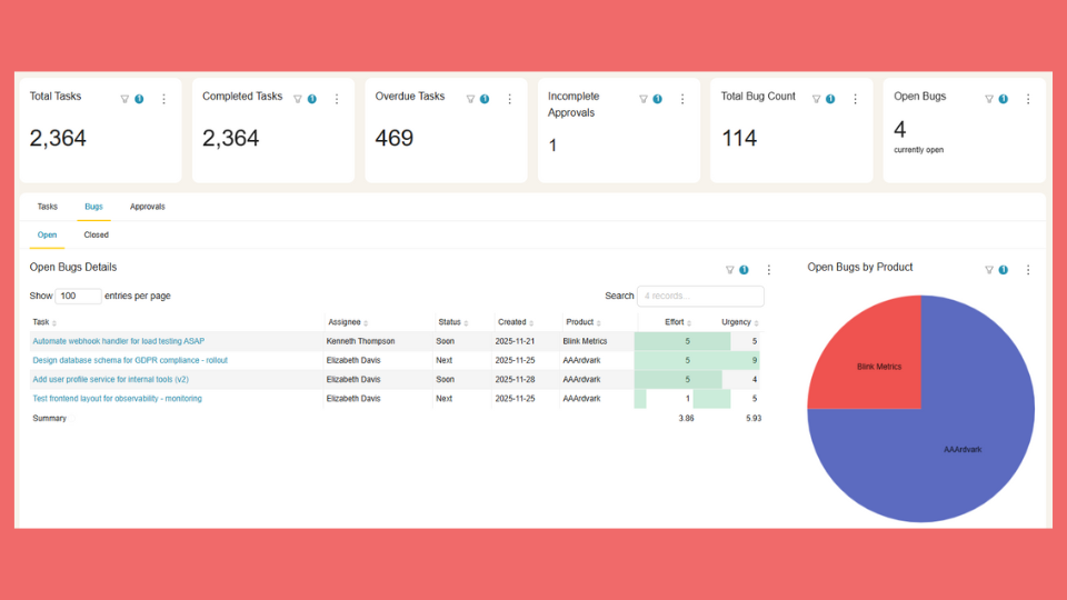
Project dashboards let you create bar charts showing tasks by assignee. This makes it visible when one person has significantly more tasks than everyone else and the workload should be shuffled.
For deeper workload analysis, Asana offers a separate Workload view (available in portfolios on Business and Enterprise plans) that shows hours allocated per person across multiple projects. The dashboard and Workload view serve different purposes: dashboards show task counts within a project, while Workload shows effort allocation across your portfolio.
Either way, visibility into distribution helps managers spot imbalances before they become problems.
Goal alignment without spreadsheet tracking
Asana lets you link projects to goals. When you do, progress updates automatically based on task completion.
This connects daily work to strategic objectives without maintaining a separate tracking spreadsheet. Team members see how their tasks contribute to bigger goals. Managers see whether initiatives are on track without asking.
Accountability without micromanagement
When completion and delays are visible to everyone, transparency replaces check-ins.
Team members know their work is visible. That’s not surveillance; it’s shared context. Everyone can see the same dashboard, so there’s less need for managers to follow up individually asking “is this done yet?”
The dashboard answers the question before it gets asked.
The scalability question
The capabilities above work well for a single project with a single team. But most organizations don’t stay at that scale.
Beyond individual projects
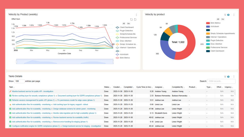
Asana does offer cross-project visibility. Portfolio dashboards let you see status across multiple projects, and Universal Reporting (available on Business and Enterprise plans) can pull data from your entire organization. As of 2025-2026, Asana has added multiple dashboard tabs per project, time and cost reporting in portfolios, and the ability to save dashboard views on templates.
So project-level dashboards aren’t your only option.
Where consistency gets hard
The challenge is consistency at scale. When you have 50 client projects and want the same dashboard layout in each one, you’re still configuring each project dashboard individually. Portfolio dashboards show rollups across projects, but they don’t replace per-project dashboards.
Universal Reporting helps aggregate data, but building identical per-project views that deploy automatically to new projects isn’t something native Asana supports.
For the technical details on what Asana dashboards can and can’t do, see our Asana dashboard guide.
When native dashboards are enough
Native Asana dashboards deliver genuine team empowerment when:
Team size is manageable.
Under 10-15 people where everyone can check one or two projects.
Project scope is focused.
One major initiative at a time, not dozens of parallel workstreams.
Stakeholders log into Asana.
Leadership doesn’t need external reports; they’re willing to check the dashboard themselves.
You need current status, not historical comparisons.
Today’s picture matters more than trend analysis over months or quarters.
If this describes your team, native dashboards will serve you well. Stop reading and go build yours. Check out our Asana dashboard examples for specific configurations by team and project type.
When you need more than native dashboards
You’ve outgrown native dashboards when:
Recreating dashboards takes hours.
Operations leads (or you) spend significant time setting up the same dashboard for every new project or client.
Historical questions go unanswered.
Leadership asks “how does this quarter compare to last?” and you can’t answer because Asana doesn’t store historical snapshots.
You’re combining data in spreadsheets.
You’re exporting Asana data and merging it with time tracking or budget data to get the full picture.
Views are inconsistent.
Different team leads have different dashboard setups. There’s no standard for what metrics get tracked.
What enhanced empowerment looks like
When you’ve hit these walls, the solution is consistent dashboards across every project automatically, historical trends so teams can learn from patterns, and combined data from Asana plus time tracking plus budget in one view.
BlinkMetrics creates unified dashboards that pull from multiple Asana projects, track history over time, and deploy to new projects automatically. Build once, empower everywhere.
See how BlinkMetrics enhances Asana dashboards →
Your team deserves dashboards that scale with your work.
Asana dashboards empower visibility, alignment, task distribution awareness, and accountability. That’s genuine value for teams managing project work.
Asana also offers portfolio dashboards and Universal Reporting for cross-project visibility. Where teams still hit walls is consistent per-project dashboards that deploy automatically, deep historical trend analysis, and combining Asana data with other sources in a single view.
For teams that need templated dashboards across every project, BlinkMetrics automates what Asana requires you to build manually.
Related guides
- The complete guide to Asana dashboards
- Asana dashboard examples — 13+ templates and ideas for your team
- Asana KPI dashboard — how to track key metrics
Frequently asked questions
What is the best answer for “what can an Asana dashboard empower your team to do?”
For certification: visualize progress, balance workload, track goals, communicate status. For real-world use: visibility without meetings, accountability without micromanagement.
Can teams share Asana dashboards with stakeholders who don’t use Asana?
Not directly. Stakeholders need at least view-only project access to see the dashboard. For external sharing, teams typically screenshot dashboards or use tools like BlinkMetrics to create shareable dashboard links that don’t require Asana login.
Do Asana dashboards help with remote team management?
Yes. The async visibility is valuable for remote teams because team members can see status without real-time meetings. The gap is historical tracking: if you were offline for a week, you can see the current state but not what changed while you were away.