
Every small team has the same problem, and no amount of hustle makes it go away: there is always more to do than there are hours to do it. A customer emails about something broken. A new account is waiting on setup. There’s a half-finished feature in review, a deal that needs a demo by Friday, and a backlog of “wouldn’t it be great if.” Everything feels urgent. Everything has someone behind it who wants it now.
For a long time we resolved that tension the way most teams do: have a meeting, discuss the pros and cons, and an hour later make a decision or just work on whatever seems “top priority” to each team member in the moment. Not great.
So we did the thing we tell our customers to do with their business data: we stopped guessing and made it measurable. The result is a system with two parts. A priority pyramid decides what kind of work matters most, and an urgency score decides which task to do first. Here’s how it works, why splitting prioritization into those two questions changed everything, and how we now build the same system inside our customers’ Asana.
The problem with a single priority field
Most task tools give you one field for priority: High, Medium, Low. It feels organized. It isn’t.
The trouble is that “priority” is actually two different questions wearing one label. The first is a question of category: is this keeping a paying customer’s product running, or is it a nice-to-have polish task? Those aren’t on the same scale: one is existential, one is optional, and no amount of “High” tagging captures the gap. The second is a question of sequence: given five things that are all genuinely important, which one do I open first this morning?
Collapse those into one field and you get the worst of both. A “High” outage and a “High” feature request look identical in your list. A team member with ten “High” tasks is right back where they started, staring at a wall of equally-flagged work with no idea where to begin.
We needed to answer both questions separately. That’s why we built two things instead of one.
What Asana’s priority field actually gives you
Before describing what we built, it’s worth being precise about what Asana does natively, because the gap is narrower than people assume in one direction and much wider in another.
Asana handles the tagging well. A single-select custom field called Priority with values like High, Medium, and Low takes about a minute to create. You can filter any view by it, sort by it, group a board by it, and build rules that set it automatically when a task moves into a particular section. Every project can share it. None of that is the problem.
Here’s where it stops:
| What you can do natively | What you can’t |
|---|---|
| Tag every task with a priority value | Compute a value from other fields (due date, dependencies, layer) |
| Filter and sort by that value | Rank tasks within one person’s queue |
| Group a board or list by priority | Recalculate automatically as deadlines approach |
| Chart how many tasks sit in each priority | Chart completed work by priority over time |
| Set priority via a rule | Weight one task against another when both are “High” |
The short version: Asana can store a priority you decide, but it can’t derive one. Every value in that field got there because a human typed it, which means the field is only ever as current as the last time somebody revisited it, and nobody re-reads a hundred open tasks to check.
That’s the gap. Not “Asana has no priority field,” but “Asana’s priority field can’t do arithmetic, and prioritization is arithmetic once you’re past about twenty tasks.”
Part one: the priority pyramid
The pyramid answers the category question. It’s a stack of layers, foundation first, from the work that keeps the lights on at the bottom to growth work at the apex.
Here’s ours, as it actually runs in our Asana today:
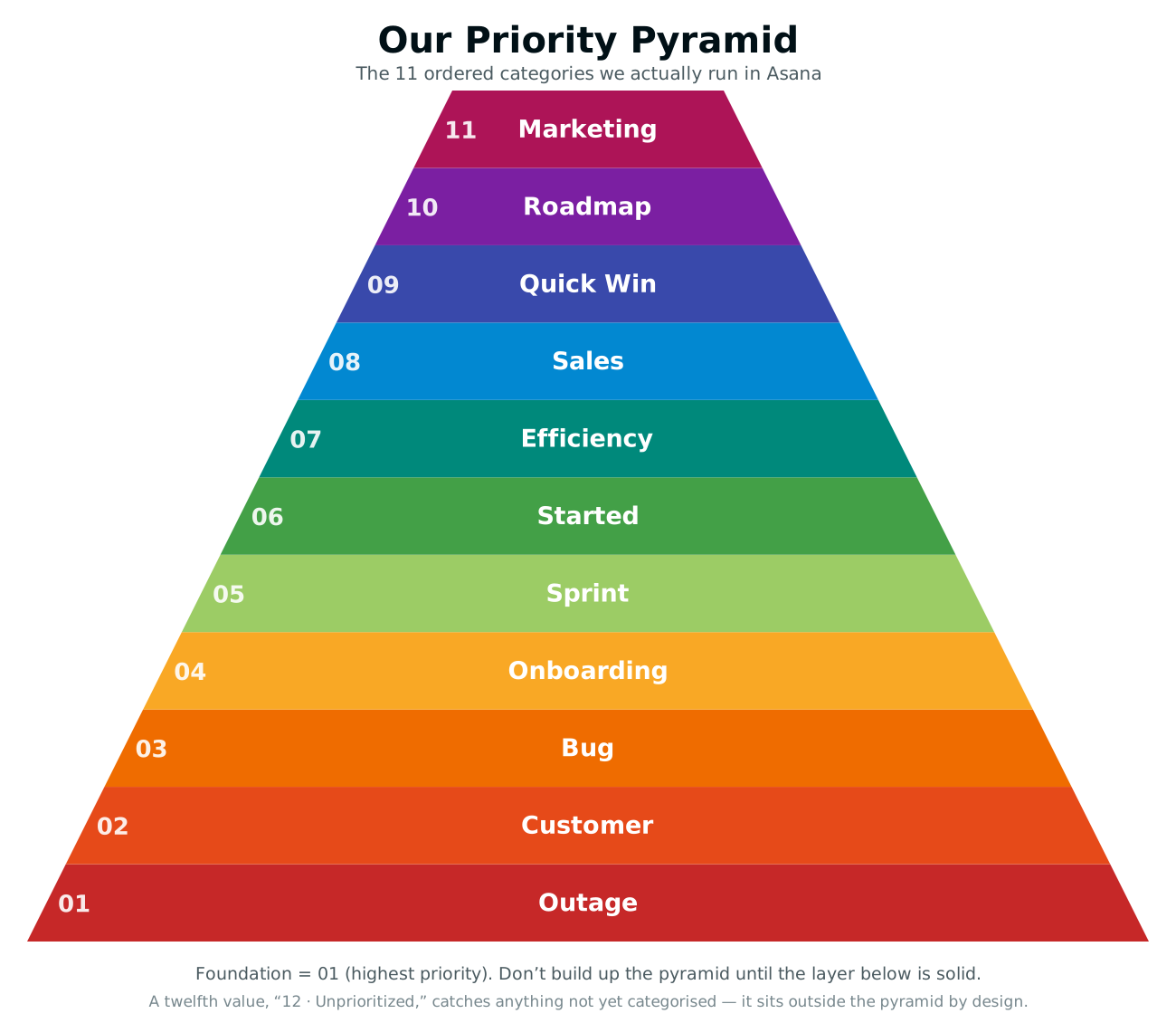
Eleven categories, with a twelfth value (“Unprioritized”) catching anything nobody has classified yet. That’s more granular than most teams need.
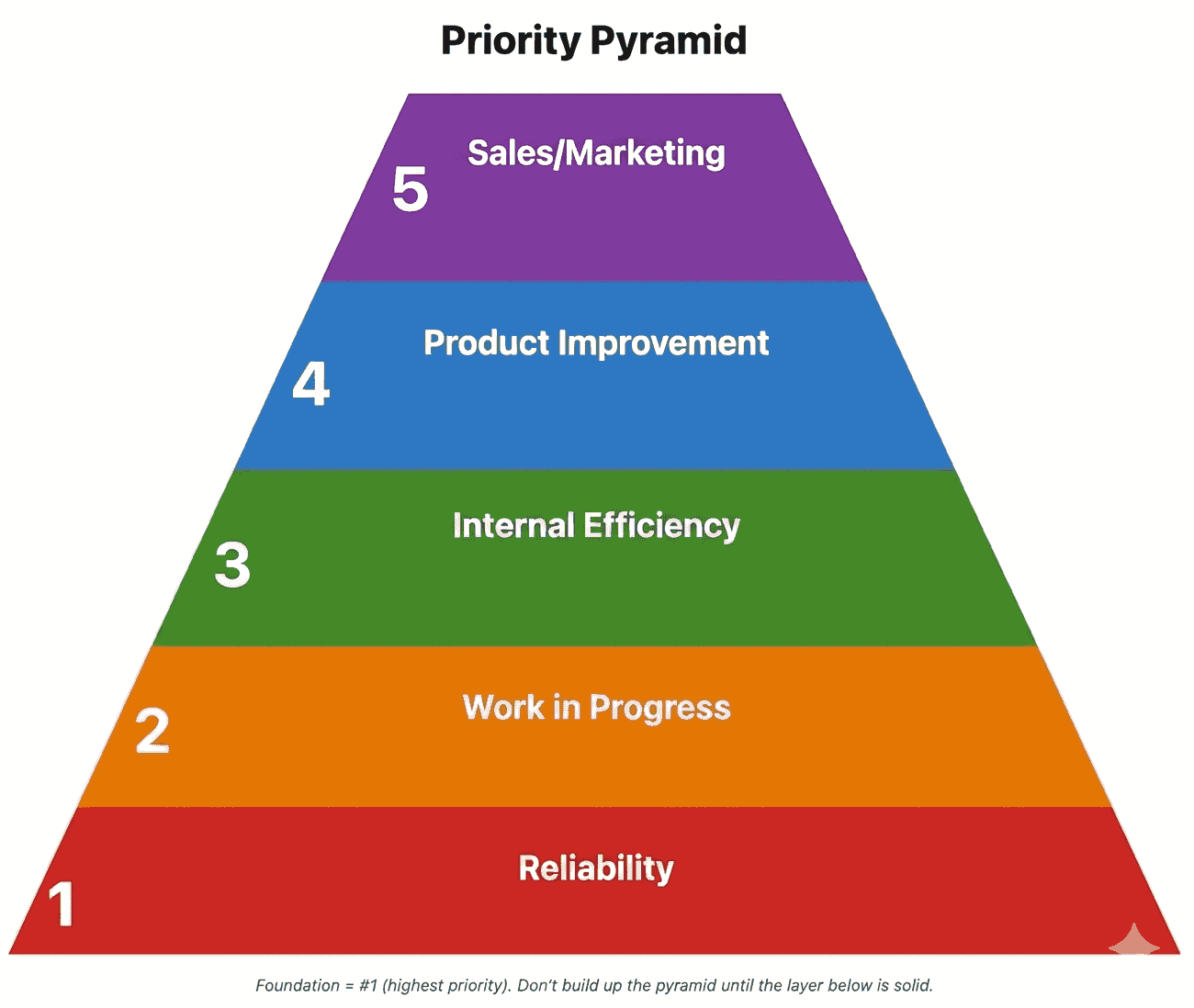
You almost certainly shouldn’t start here. A simpler pyramid that everyone applies the same way beats a detailed one people have to stop and think about, and the whole point is to remove deliberation, not relocate it. Most companies can collapse this to something like five tiers and lose nothing that matters:
Compare the two and you can see what the simplification does. Outage, Customer and Bug all collapse into Reliability, three different ways of saying “something we already sold isn’t working properly.” Onboarding, Sprint and Started collapse into Work in Progress. The five-tier version makes the same calls as ours in the overwhelming majority of cases; ours only pulls ahead in the narrow situations where two tasks sit in the same tier and we still want a defensible order.
So start with the distinctions your business genuinely argues over. Add a category the day you catch yourself wanting to rank two things that currently share a layer. Working from the foundation up, in the simplified form:
- Reliability: the things you already sold have to keep working. Outages, broken features, the degraded experience a real customer feels today. If what you promised isn’t running, nothing higher up the pyramid matters. Drop everything.
- Work in Progress: finish what’s already started before you start something new. A half-built feature in review and a stalled customer onboarding are both liabilities until they cross the line. Finishing what’s in flight beats opening a new front.
- Internal Efficiency: work that gives your team time back. Headcount rarely grows as fast as the workload, so an hour saved this month compounds all year. A script that kills a manual step, a check that catches a recurring mistake.
- Product Improvement: the roadmap. New capabilities, bigger bets, the features that move the product forward. Important and necessary to drive the business forward, but only genuinely safe to invest in when the three layers below are healthy.
- Sales/Marketing: growth work at the top of the funnel. Demos, content, campaigns, the assets that bring the next customer in. Real and necessary, but it sits on top of a stable foundation, not in place of one.
The shape matters. It’s a pyramid, not a list, because each layer assumes the ones below it are solid. There is no point polishing a marketing campaign (the apex) while production is down (the base). When a new request lands, we walk up from the foundation: is anything in a lower, more critical layer waiting? If yes, that wins. A trade-off that used to be an argument (“do I chase this new feature or finish the one in review?”) now resolves by reading the layer. Work in Progress sits below Product Improvement, so finishing the in-flight work wins. No debate required.
One subtlety: a task can live in more than one layer. An in-flight onboarding that’s also waiting on a fix is genuinely both Reliability and Work in Progress, and we tag it as both. Real work is rarely one clean category.
Part two: the urgency score
The pyramid tells you which kinds of work matter. It doesn’t tell you which of your seven in-progress tasks to open first. That’s the sequence question, and we answer it with a single number computed automatically for every task, with no human judgment and no debate.
The urgency score starts with the task’s layer in the pyramid (a foundation task is worth far more than an apex one) and then adds points for the signals that should move something up the queue. We tune the exact factors and weights to the team, but they usually include:
- Due-date pressure. Deadlines pull work forward. Something due in three days climbs hard; something overdue climbs harder.
- Blockers. A task that other tasks depend on gets a bump, because clearing it unblocks the whole chain.
- Strategic focus. Work that’s on this quarter’s declared priorities scores higher than work that’s off-theme.
- Who’s waiting. When a task has a customer or a teammate stalled behind it, that weight shows up in the number.
There’s a deliberate counterweight, too. A recurring task (a weekly report, a quarterly review) shouldn’t scream for attention three weeks before it’s due, so the score holds it back until it’s actually time. It surfaces when it should, and not a moment sooner.
The key design decision: this calculation is completely deterministic, not a black box. Same task, same inputs, same score, every time. Every number is explainable down to the points. Because the inputs live in the task itself (its layer, its due date, its dependencies), the score recomputes itself whenever anything changes, and it refreshes automatically every day. A task that goes a day overdue, a deadline that creeps closer, a task that suddenly blocks two others: the number moves on its own, and the board re-sorts. Every morning, the top of the list is genuinely the right thing to work on, and nobody had to spend a meeting deciding that.
Why split it in two
The lesson here is that what matters and what’s next are different questions, and trying to answer them with one field fails both.
The pyramid is human and editorial: it encodes your values about what kind of work deserves attention, and it almost never changes. The urgency score is mechanical and live: it churns constantly as deadlines and dependencies shift. Keep them separate and each one gets to be good at its job. The pyramid stays a stable framework everyone can reason about. The score stays an honest, up-to-the-minute ranking nobody has to argue over.
The payoff is the thing we were chasing the whole time: anyone can open Asana, sort by the urgency score, and trust that the task at the top is the right one, not the loudest, not the easiest, not whatever was mentioned most recently in chat. The judgment got baked into the system once, so it doesn’t have to be re-litigated every single day.
What the score makes visible
Everything so far is about helping one person decide what to open next. The second-order effect turned out to be the more valuable one: once every task carries a layer and a score, work becomes measurable in ways it simply wasn’t before. We’ve built custom reporting dashboards pulling in all of our Asana data. These are the views we now run our own week on.
The traction chart
This is the one we’d keep if we could only keep one: completed tasks per week, stacked by pyramid layer.
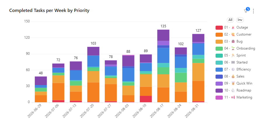
That’s ours, straight out of our own Asana data feeding into our BlinkMetrics dashboard.
Read it over a quarter and it tells you something no completion count can. A team closing 40 tasks a week made up mostly of outages and bug fixes is busy and going nowhere, because every hour is spent defending the base of the pyramid. The same team closing 40 tasks a week made up mostly of product and growth work has escaped, and the chart shows the moment it happened. What you’re steering toward is a visible shift in the mix: the bottom bands shrinking, the top bands expanding.
If you run EOS, this is a traction measure in the literal sense. Most teams end up proxying traction with completion volume, which rewards whoever closes the most small things. Weighting by layer measures whether the work got more valuable, not just more numerous, and it doesn’t get drowned out by the tide of small admin tasks the way a raw count does.
Workload balance, weighted by what’s actually urgent
Counting open tasks per person tells you who has the most. It doesn’t tell you who’s in trouble. Forty routine items is a comfortable week; fifteen genuinely pressing ones is not.
With a score on every task you can set a threshold for what counts as urgent in your business and compare people on that basis instead. The view that matters is completed-versus-open above that line, per person: someone closing high-urgency work as fast as it arrives is fine, and someone with a large and growing open pile is not, even if their raw task count looks unremarkable. One is a reassignment conversation; the other is a performance one, and the open pile tells you which you’re in.
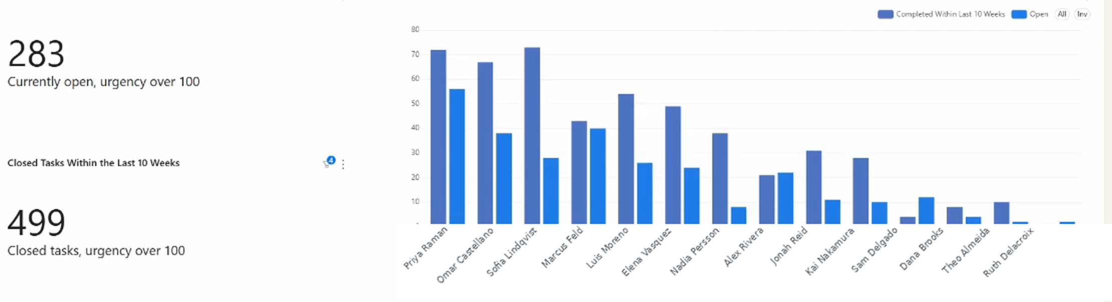
Alongside it, the percentage of each person’s workload that’s high-urgency shows whether one person has quietly become the place all the critical work goes.
Rough delivery forecasts, without asking anyone
Because the score ranks a person’s whole queue, any individual task has a position in it. Knowing a task is third in line for its owner is a far better answer to “when will this be done?” than a due date nobody set deliberately. It says two things come first, so probably not today.
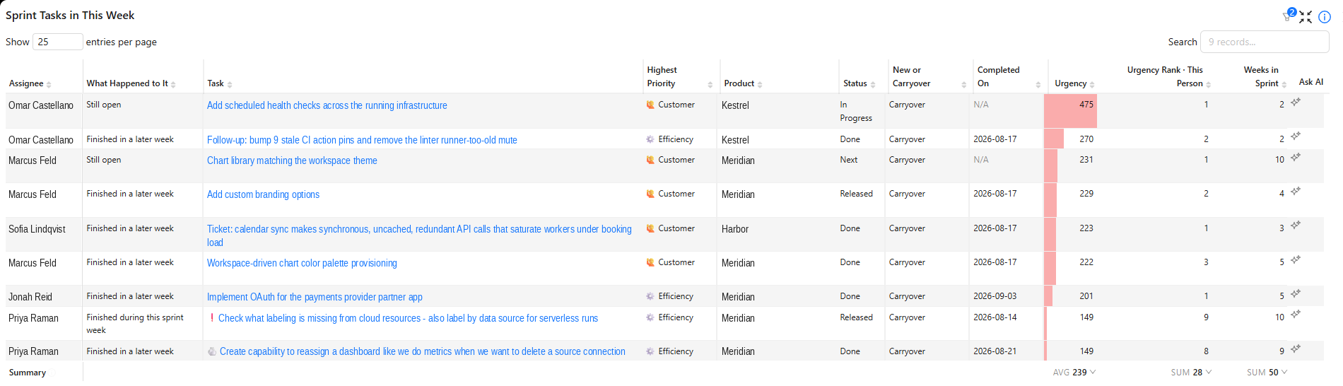
It also makes the fix obvious when the answer isn’t good enough. If something is ranked eighth and needs to happen tomorrow, either the factors driving the score are missing context worth adding, or it needs to move to someone with a shorter queue. Both are visible in seconds rather than after a status meeting.
Whether the interruptions were justified
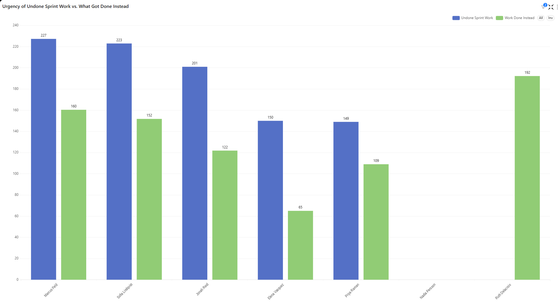
Every team gets pulled off plan. The question worth answering isn’t whether it happened but whether it was defensible, and with a score on everything that becomes arithmetic.
Compare the average urgency of the planned work that didn’t get finished against the average urgency of the unplanned work that got done instead. If the unplanned work scored higher, the team made good calls under pressure and the plan was wrong. If it scored lower, something is pulling attention toward whatever is loudest rather than whatever matters, and that’s a process problem worth naming. It reframes a conversation that’s otherwise entirely vibes-based, and it does it without implying anyone was slacking.
The housekeeping the score exposes
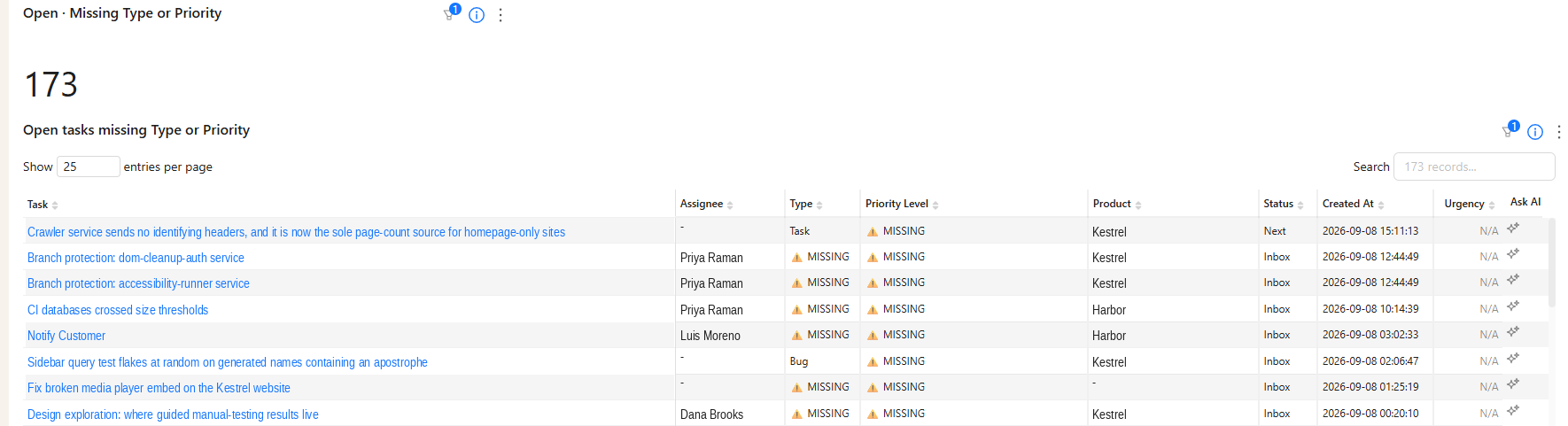
One useful side effect: a task with no layer assigned gets no score, so it never surfaces in any ranked view. That makes untagged work visible as a gap rather than letting it sit invisibly in the backlog.
Prioritization built inside your Asana — reporting on a custom dashboard
We didn’t set out to productize this. We built it because our own team needed it. But it turns out the hardest part isn’t the idea, it’s the wiring: defining the layers that fit your business, choosing and weighting the factors, and getting a live score onto every task without disrupting how people already work.
So that’s what we do now. We configure the priority engine directly inside your Asana, on the factors you choose (due-date pressure, blockers, strategic focus, who’s waiting), and it writes a transparent priority score to every task, refreshed daily. Nothing changes about how your team works day to day; they just get one objective ranking they can sort any view by, so the most important work rises on its own. We build it, document it for your team, and re-tune the weights with you as priorities shift each quarter.
None of this is Asana-specific. That just happens to be the project management tool we use ourselves. The pyramid is a way of thinking about work; the score is arithmetic over fields your PM tool already holds. If you run monday.com or ClickUp instead, we can build the same engine there.
We build BlinkMetrics on a simple belief: the decisions running a business shouldn’t live in someone’s gut, where they’re invisible, inconsistent, and impossible to scale. Your dashboards already show you what’s happening. This decides what your team does next, and it’s the same data-driven thinking, pointed at your team’s attention instead of your reports.
Want your team’s work ranked automatically, and the traction chart that comes with it? Book a call with Nathan and we’ll map the pyramid to your business on the call.
FAQ
Can Asana calculate a priority score automatically? No. Asana’s priority field stores a value someone selected; it can’t derive one from a task’s due date, dependencies, or category. Rules can set a value when a task meets a condition, but they don’t compute or recompute a number as circumstances change.
How is this different from just using High / Medium / Low? High/Medium/Low answers what kind of work matters, and only in three coarse steps. It can’t sequence ten tasks that are all High, which is the situation most people are actually in when they ask what to work on. The pyramid handles the category question properly, and a separate calculated score handles the ordering.
Do we have to change how our team uses Asana? No, and that’s largely the point. The layers attach to tasks as a custom field and the score is written to another one. People keep working in whatever views they already use; they just gain one field worth sorting by.
What factors should feed the urgency score? Start with the ones that already drive your decisions informally: how close the deadline is, whether anything is blocked behind the task, whether it’s on this quarter’s stated priorities, and who’s waiting on it. The specific weights matter less at first than the fact that they’re written down and applied consistently.
How many layers should our pyramid have? Fewer than four and you’re back to a coarse priority field that can’t sequence anything. Above that there’s no single right answer: we run eleven categories, and the simplified five-tier version in this post would serve most teams just as well. Start with the distinctions your business genuinely makes, and add a layer the day you want to rank two things that currently sit in the same one. The test that matters is whether someone new can place a task correctly without asking, and a shorter list usually passes that test more easily than a longer one.
What if a task belongs in two layers? That’s normal, and worth supporting deliberately. An in-flight customer onboarding that’s also waiting on a bug fix is genuinely two categories at once. Score it from its highest (most critical) layer so it can’t be counted twice or ranked too low.