
Short answer: Asana doesn’t have a native burndown chart that reads from a custom field like story points. You can see task completion charts and goal progress bars, but nothing that plots remaining effort over time within a sprint. For that, you need a reporting dashboard that reconstructs remaining effort across the sprint from your task data.
Asana tracks which tasks are complete and which aren’t. What it can’t do is sum a custom numeric field (story points, hours, complexity score) and plot how that number decreases as your team works through a sprint. That’s the gap this post addresses.
What a burndown chart shows
A burndown chart plots remaining work against time. The x-axis is the sprint timeline (day 1 through day 10, for example). The y-axis is effort remaining, typically story points, but any numeric effort field works.
Two data points drive it:
- Total effort at sprint start: the sum of all story points in the sprint backlog when the sprint begins
- Completed effort per update: the sum of points on tasks marked complete, subtracted from the remaining total
The chart produces a line that should trend downward toward zero by the last day of the sprint. An “ideal line” (a straight diagonal from total points to zero) is drawn for reference. Your actual completion line compares against it.
Burndown answers two questions:
- Are we on track? If your actual line is above the ideal line, you’re behind. Below it, you’re ahead.
- How fast are we burning through work? The slope of the line tells you whether the pace is sustainable.
This is different from velocity. Velocity measures how many points your team completed in a sprint (useful for planning future sprints). Burndown measures how many points are still left in the current one (useful for adjusting mid-sprint).
What Asana offers natively
Asana has chart widgets you can add to dashboards: bar charts, donut charts, number widgets, and completion charts. Here’s what each one can show:
| Widget type | What it tracks | Burns down by custom field? |
|---|---|---|
| Completion chart | Tasks completed over time | No (counts tasks, not effort) |
| Bar chart | Task count by status, assignee, or custom field | No (counts only, no time series) |
| Number widget | Total task count or count by filter | No (point-in-time count, no trend) |
| Portfolio progress | Portfolio-level completion % | No (based on status, not custom fields) |
Asana’s chart widgets count tasks. They don’t sum custom numeric fields, and they don’t trend that sum over time.
You can see total story points in a project column footer if you set up a custom field. You can sort and filter by story points. But the moment you want “remaining story points on day 6 of a 10-day sprint,” you’re outside what Asana can produce.
Why custom fields don’t connect to charts
This isn’t a configuration gap. It’s how Asana’s data model works.
A burndown chart requires two things Asana doesn’t provide together:
- A remaining-effort figure for each day of the sprint: on day 1 the sprint has 80 points left, on day 3 it has 65, on day 6 it has 42.
- A chart that plots those figures over time: the descending line is what you get from connecting them.
Asana produces neither. It knows the current state of every task’s fields, and it logs changes in the activity feed, but that feed isn’t something a chart widget can query. You can’t ask Asana “what was the sum of story points on incomplete tasks on day 6 of the sprint?” and get an answer.
Worth noting, because it’s the basis of every workaround below: that daily figure doesn’t have to be captured live. Given each task’s effort value and the date it was completed, you can calculate what was outstanding on any past day after the fact. Asana holds both pieces. It just has nowhere to put the result.
This is also why the manual workaround (building a burndown in Google Sheets) requires you to log the number yourself every day. You’re doing the snapshotting manually because Asana doesn’t do it for you.
How to get a burndown chart from Asana data
There are two realistic paths:
Option 1: Manual Google Sheets burndown
This works for small teams willing to maintain it:
- At sprint start, record total story points in a spreadsheet row
- Each day (or each standup), filter Asana for completed tasks in the sprint, sum their story points, and record the remaining total
- Use the data to build a line chart in Google Sheets
The chart updates only when someone manually enters the new remaining-effort number. If you miss a day, the line has a gap. Miss three days in a row and you lose the granularity that makes burndown useful.
For teams with 3-5 people running short sprints, this is manageable. It breaks down when sprints get longer, teams get larger, or you’re running multiple concurrent projects.
Option 2: A reporting dashboard that rebuilds the curve for you
The burndown gets rebuilt from data Asana already holds, rather than from a number someone logs each morning.
Every task carries an effort value and a completion date. Remaining effort on any given day of the sprint is just total committed effort minus everything completed on or before that day, which means the whole curve can be reconstructed after the fact, for the current sprint and for sprints that ended months ago. The ideal line comes from the sprint’s start date, end date, and starting total, so it’s drawn alongside without needing any history at all.
During setup, you’ll point us at the custom field you use for effort (story points, hours, complexity), the section or tag you use to group sprint tasks, and the sprint start and end dates. From there we’ll give you a chart that generates and updates on its own as tasks are completed.
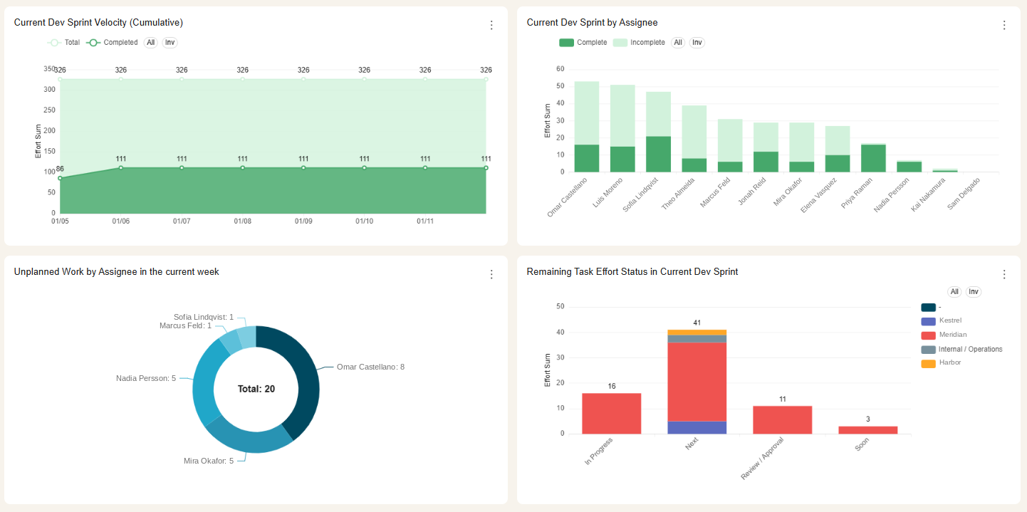
The top-left panel is the same data a burndown draws, plotted the other way up: the flat line at 326 is what the sprint committed to, the rising line is what has been completed, and the gap between them on any given day is the remaining effort a burndown would show descending. The bottom-right panel then says where that remainder actually sits — 41 points still in Next, 16 in progress, 11 waiting on review — which is the question that usually follows once the curve tells you that you are behind.
One limitation worth stating plainly. Because the curve is reconstructed from current sprint membership, it assumes the tasks in the sprint today were in it the whole time. If work is added or dropped mid-sprint, the reconstructed line won’t show the step change at the moment it happened; it’ll spread that scope across the sprint instead. For teams whose sprints are largely fixed once they start, this is a non-issue. For teams who add work mid-sprint routinely, the burndown will understate how much churn there was, and the honest way to see that churn is to measure unplanned work directly rather than trying to read it off the burndown.
Want a live burndown for your team’s current sprint, without logging numbers into a spreadsheet every day? Schedule a demo with Nathan and we’ll set it up against your effort field and your sprint dates.
Reading your burndown: what the chart tells you
Once you have a burndown chart, here’s how to interpret common patterns:
Flat line at the top (first few days) No story points are being completed. Common causes: sprint kickoff delays, tasks blocked on dependencies, or unclear scope. Worth flagging on day 2 if the line hasn’t moved.
Steep drop early, flat near the end The team front-loaded the sprint. Easy tasks went first, harder ones got saved. If those remaining tasks stall, you’ll miss the sprint. This is a scope risk pattern.
Actual line consistently above the ideal line You’re behind. The choices are: descope, add capacity, or accept a miss and improve planning for next sprint.
Actual line below the ideal line You’re ahead. Consider pulling backlog items into the sprint rather than letting the team idle.
A curve that never quite reaches zero, sprint after sprint Consistent over-commitment. The team is planning more than it can finish, and the gap at the end of each sprint is roughly how much. That number is a better basis for next sprint’s commitment than an optimistic estimate.
One pattern to be careful about: mid-sprint scope changes don’t reliably appear as a step up in the curve, for the reason described above. If you suspect work is being added after the sprint starts, measuring unplanned work directly will tell you far more than staring at the burndown will.
Does Asana have a native burndown chart?
No. Asana has completion charts and task count visualizations, but no chart that reads from a custom numeric field and shows remaining effort over time. The closest native option is a completion chart (tasks completed per day), but this tracks task count, not effort.
FAQ
Can you use Asana story points for burndown? Only with a reporting dashboard. Asana lets you create a story points field and assign values to tasks, but it has no chart that sums that field and trends it down across a sprint.
What’s the difference between a burndown chart and velocity? Burndown shows remaining work within the current sprint and answers “are we on track?” Velocity measures completed work per sprint over time and answers “how much should we commit to next sprint?” Both use story points but serve different planning questions.
How do I track remaining effort in Asana? Natively: manually sum story points on incomplete tasks. For an automated view, a tool like BlinkMetrics reads your Asana data on a schedule and builds the chart without manual entry.
What effort field should I use for burndown? Any numeric custom field works: story points, hours estimated, t-shirt size converted to numbers, or a simple complexity score. The field needs to be numeric and assigned to tasks in your sprint.
Related reading: the complete guide to Asana dashboards, how to track sprint velocity in Asana, and Asana KPI dashboards.