
Short answer: Asana can show completed vs. open tasks per person. Build a bar chart with assignee on one axis and split it by completion status, and you get the comparison in a single view. What it won’t do is weight that by effort instead of task count, or sit alongside the numbers from your other tools.
The view team leads actually want
During sprint reviews and project check-ins, the question is usually some version of: “Where is everyone right now?”
The answer requires seeing, in one view:
- How much work each person took on
- How much they’ve completed
- How much is still open
- Whether anyone is behind or overloaded
Asana can chart the task-count version of this. What takes longer is the version most leads actually want: work weighted by effort, scoped across the projects that matter, with last sprint’s numbers sitting next to this one’s.
What Asana shows per assignee
Asana has several views that touch per-person task data:
My Tasks: each team member’s own view of their assigned tasks across all projects. As a team lead, you’d open each person’s profile individually to see it.
Workload view (higher-tier plans): open task count per person across their assignments, with a timeline of task density. Useful for capacity planning, though it’s about open work rather than a completed-vs-open split.
Filter by assignee: in any project, filter the task list to one person’s tasks. Switching between people means clearing and re-applying the filter.
Reporting charts (higher-tier plans): this is the one that does the job. A bar chart with Assignee on the X-axis, split by completion status, puts completed and open counts for every team member side by side. You build and maintain it yourself, and it reports on the scope you point it at.
So the single-view comparison is available natively, on qualifying plans. Three things it won’t do:
- Weight by effort. The charts count tasks. Someone who closed ten small tasks looks more productive than someone who shipped one large story, even when the second person moved more work.
- Carry its own history. Reporting reflects current state. Comparing this sprint’s distribution against the last six isn’t something native charts retain for you.
- Blend with anything outside Asana. “Completion next to hours tracked, or next to what we billed” isn’t a question Asana can answer on its own.
If you’re not on a reporting tier
Two manual approaches work at low volume:
Manual filter per person:
- Filter the project by Assignee = [Person A]
- Check the incomplete and completed section counts
- Note the numbers
- Repeat for each team member
For 5 people, this is a 10-minute exercise per week. For 10 people across 3 projects, it’s a 90-minute exercise that rarely survives a busy week.
CSV export:
- Export the project to CSV (the tasks export includes assignee name and completion status)
- In a spreadsheet, build a pivot table with Assignee as rows and count of tasks as values
- Filter on complete = true / false to get the split
This gives an accurate snapshot as of the export. It doesn’t update, and you re-export every time you want a current view.
Getting a live completion-by-assignee view
BlinkMetrics reads your Asana tasks and builds the per-person breakdown for you, maintained on your behalf rather than being one more chart to configure. The dashboard puts completed work per team member side by side, with a week-by-week completion trend and the average cycle time sitting behind those numbers.
Two things native charts don’t reach:
History. Completion tracked week over week, so this month’s distribution sits next to the last several instead of disappearing when the board moves on. Asana’s charts report the current state; they don’t keep the trend for you.
Effort weighting. Alongside the task-count view, the same breakdown can be measured against your effort field. Two people can each close five tasks having moved very different amounts of work, and summing effort is what tells them apart.
Scope it with the filters that matter: completion-date range, assignee, product, task type. Data refreshes automatically on a set schedule, as often as your plan allows, so the view stays current without anyone exporting anything.
Where this earns its place:
Standup or sprint review: put the chart on screen instead of asking each person for a verbal update. Everyone sees their own status relative to the team.
Workload balancing: if one person is carrying several times the open effort of anyone else, that’s visible immediately. Redistributing doesn’t require a manual count.
Retrospective prep: before a retro, the completion distribution shows whether work was spread evenly or concentrated on a few people.
Balancing by what’s urgent, not just what’s numerous
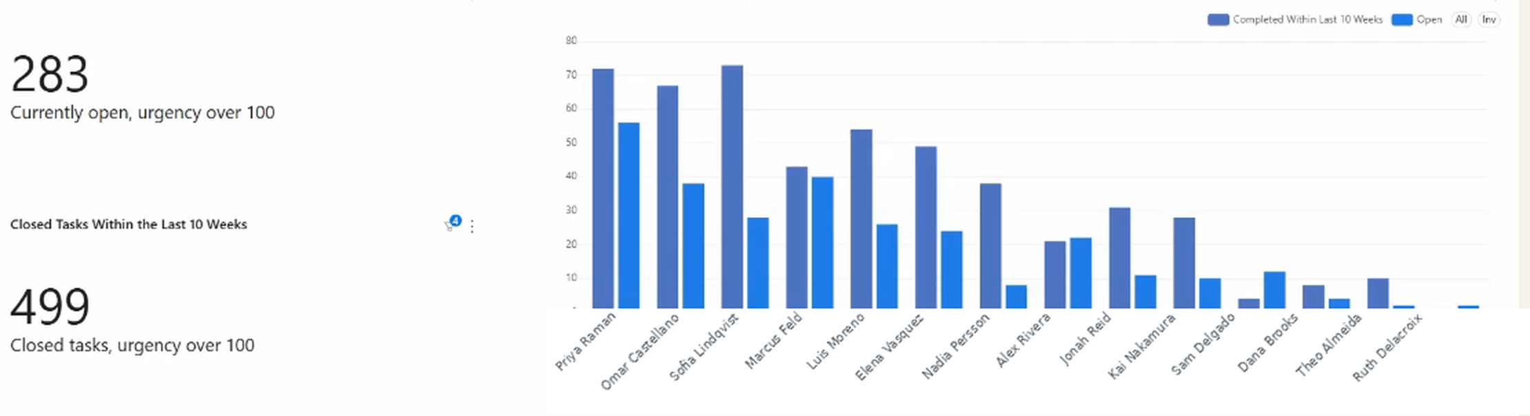
Raw open-task counts flatten a real difference: someone sitting on forty routine items is in a very different position from someone sitting on fifteen that all matter. If your workspace scores tasks by priority or urgency, the per-person view can be filtered to the work above whatever threshold you consider genuinely pressing, and then the comparison gets actionable. One person with fifty-odd urgent items open against a teammate with fourteen is a reassignment conversation, not a performance one.
The same view shows completed-versus-open for that filtered set, which is the part that tells you whether a backlog is growing or draining. A tall open bar next to a short completed bar means the queue is winning.
The people on the left carry the most urgent work but clear it at roughly the rate it arrives. Further right the pairs invert: less urgent work in total, but more of it open than closed. A raw open-task count would have ranked those people as comfortable.
Catching the exceptions
Two per-person reports earn their place by being exception lists rather than charts. Most weeks they’re empty, and that’s the point:
Completed by someone other than the assignee. A task assigned to one person but marked complete by another. Sometimes that’s fine: a manager closing out a finished item, an automation tidying up. Sometimes it means work is being reassigned informally, or closed by someone who wasn’t in a position to judge whether it was done. Asana records both the assignee and the completing actor; putting them side by side and listing only the mismatches turns an invisible pattern into a short list you can actually review.
Tasks missing the fields your reporting depends on. If per-person reporting relies on a priority, effort, or type field, the tasks where someone left it blank quietly fall out of every chart. A list of those is a two-minute housekeeping job that keeps the rest of the numbers honest.
Want the per-person picture without clicking through Asana filters one person at a time? Book a demo with Nathan. He’ll walk you through the per-person view on a live dashboard and how it would read for your team.
Related views: workload and overdue tasks
Task completion by assignee naturally surfaces follow-on questions.
Workload view: the completion chart shows completed vs. open work in the scope you choose. Asana’s workload view shows total open tasks across all projects. Both are useful: one for status, one for overall capacity.
Overdue tasks by assignee: completion shows who has finished work; overdue count shows who has missed deadlines. Someone with high completion but many overdue tasks may be clearing easy tasks and letting harder ones slip.
Cycle time by assignee: if some team members consistently complete less, it’s worth asking whether their tasks simply take longer. That’s covered in how to measure task cycle time in Asana.
FAQ
Does Asana have a completion rate by assignee? Asana can chart completed vs. open tasks per assignee on its higher-tier reporting: a bar chart grouped by assignee, split by completion status. It reports counts rather than labelling a percentage per person, and it covers the scope you point it at.
How do I see all completed tasks by a person in Asana? In a project, filter by Assignee = [person’s name], then filter by completion status = complete. Or use Advanced Search to find all tasks assigned to that person that are marked complete.
Can Asana show me how many tasks each team member has finished? Yes, with a reporting chart grouped by assignee and split by completion status, on qualifying plans. If you want it weighted by effort, spanning several projects, or sitting next to data from your other tools, a reporting tool builds that for you.
What’s the difference between Asana’s workload view and task completion tracking? Workload view shows open tasks per person across all their projects, useful for capacity planning. Completion tracking shows completed vs. open work in a chosen scope, useful for sprint reviews and status checks.
Can I see which tasks were completed by someone other than the assignee? Not as a native report. Asana stores both the assignee and the person who marked the task complete, but it doesn’t surface the mismatch anywhere. As a reporting view it’s a short exception list, and it’s worth a periodic look, because it’s how informal reassignment and premature closeouts show up.